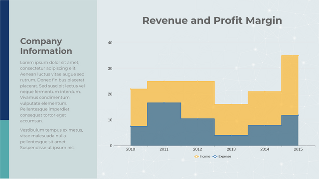
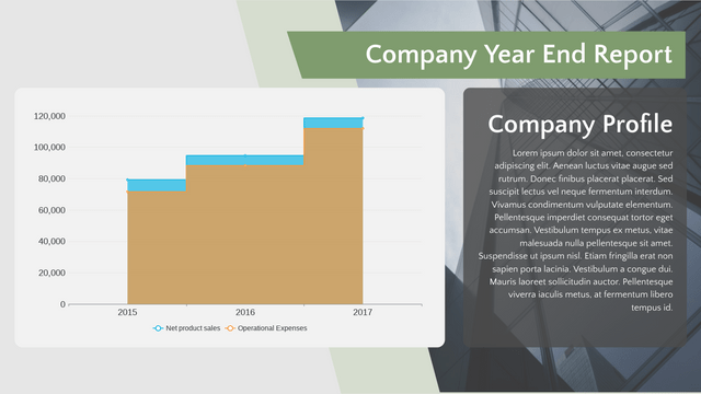
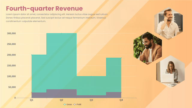
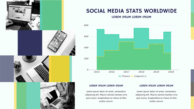
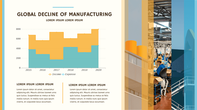
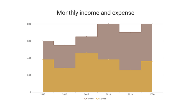
Stepped area charts are an effective way to visualize data that changes at discrete intervals. Unlike traditional area charts, which smoothly transition between values, stepped area charts emphasize the distinct changes in data, making them ideal for representing categorical data or time series where values remain constant over intervals.
Key Concepts of Stepped Area Charts
- Discrete Intervals: Stepped area charts are best for data that changes at specific points rather than continuously. This makes them suitable for situations like monthly sales figures or quarterly profit margins.
- Visual Clarity: The stepped design helps in clearly indicating the periods during which the values remain unchanged, allowing viewers to quickly grasp trends over time.
- Comparison: When multiple series are overlaid on the same chart, stepped area charts facilitate easy comparison of different datasets, revealing patterns and discrepancies.
Realistic Example: Monthly Sales Data
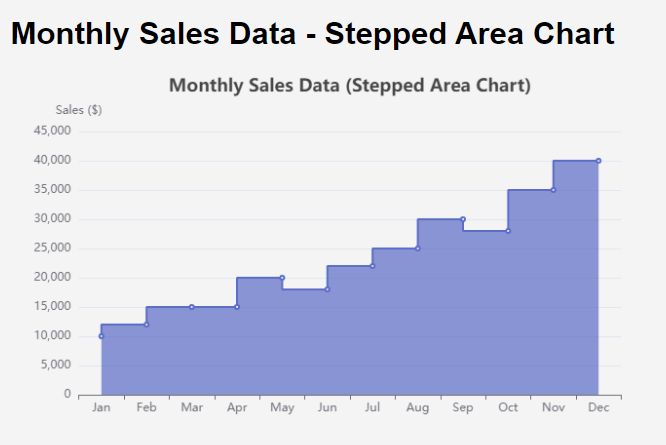
Let’s consider a retail company that tracks its sales over a year. The sales data for each month might look like this:
| Month | Sales ($) |
|---|---|
| January | 10,000 |
| February | 12,000 |
| March | 15,000 |
| April | 15,000 |
| May | 20,000 |
| June | 18,000 |
| July | 22,000 |
| August | 25,000 |
| September | 30,000 |
| October | 28,000 |
| November | 35,000 |
| December | 40,000 |
Why Use a Stepped Area Chart?
In this scenario, the stepped area chart would effectively illustrate the sales progression, highlighting the months where sales figures remained constant. This can help stakeholders understand the business’s performance and identify growth trends.
Visualizing with Visual Paradigm Online Chart
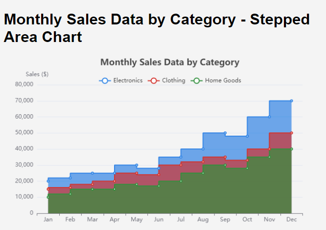
Multiple stepped area charts allow us to compare various datasets over time, highlighting distinct changes in each dataset. This is particularly useful for tracking performance metrics across different categories or groups.
Example Scenario
Let’s consider a retail company that tracks sales across three different product categories over a year: Electronics, Clothing, and Home Goods. Here’s the monthly sales data for each category:
Data
| Month | Electronics Sales ($) | Clothing Sales ($) | Home Goods Sales ($) |
|---|---|---|---|
| January | 20,000 | 15,000 | 10,000 |
| February | 22,000 | 16,000 | 12,000 |
| March | 25,000 | 18,000 | 15,000 |
| April | 25,000 | 20,000 | 15,000 |
| May | 30,000 | 25,000 | 18,000 |
| June | 28,000 | 24,000 | 17,000 |
| July | 35,000 | 30,000 | 20,000 |
| August | 40,000 | 32,000 | 25,000 |
| September | 50,000 | 35,000 | 30,000 |
| October | 48,000 | 33,000 | 28,000 |
| November | 60,000 | 40,000 | 35,000 |
| December | 70,000 | 50,000 | 40,000 |
This table provides a clear comparison of sales across the three product categories for each month of the year.
Multiple stepped area charts are powerful tools for comparing different datasets over time. Using Visual Paradigm Online, you can create visually appealing and informative charts that help stakeholders understand trends and performance across various categories. This visualization technique is particularly useful in business analytics, marketing strategies, and sales performance tracking.
Discover Visual Paradigm Online: Your Premier Visual Solution
Are you in search of a powerful tool to create stunning charts, diagrams, infographics, and more? Look no further than Visual Paradigm Online!
Why Choose Visual Paradigm Online?
Comprehensive Charting
Effortlessly design a wide array of charts—from basic bar and line charts to sophisticated stacked and radar charts. Our user-friendly interface makes data visualization simple and accessible for everyone.
Versatile Diagramming
Need flowcharts, UML diagrams, or organizational charts? Visual Paradigm Online has it all. Customize your diagrams with ease and share them effortlessly with your team.
Eye-Catching Infographics
Transform your data into captivating infographics that clearly communicate your message. Choose from a rich collection of templates and design elements to make your visuals truly shine.
Seamless Collaboration
Collaborate in real-time with your team! Share projects, collect feedback, and make edits together to ensure everyone stays aligned and engaged.
Cloud-Based Flexibility
Access your projects anytime, anywhere. Our cloud-based platform allows you to work from any device without the hassle of installations or complicated setups.
Intuitive User Experience
No design experience? No worries! Our easy-to-use tools and templates empower anyone to create professional-quality visuals in just minutes.
Unleash Your Creative Potential
With Visual Paradigm Online, you can bring your ideas to life and communicate effectively through visuals. Whether you’re a student, educator, business professional, or designer, our platform equips you with everything you need to succeed.
Start Your Free Trial Today!
Join thousands of satisfied users and explore the ultimate solution for all your visual needs. Sign up for a free trial today and see how Visual Paradigm Online can elevate your projects to the next level!
Visual Paradigm Online – Where Your Ideas Become Visual Masterpieces!
Conclusion
In today’s data-driven world, visualizing information effectively is key to understanding trends an Visual Paradigm Online Chart, businesses can create interactive and insightful visualizations that highlight important patterns in their data.
For those seeking a comprehensive solution for their charting and visualization needs, Visual Paradigm Online Chart stands out as an ultimate option. This platform offers a user-friendly interface, a wide variety of chart types, and powerful customization features that enable users to create stunning visualizations effortlessly. Whether you’re analyzing sales performance, tracking marketing strategies, or presenting complex data, Visual Paradigm Online Chart provides the tools necessary to transform your data into compelling visuals that communicate your message effectively.
