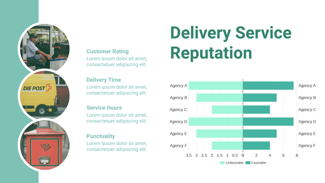
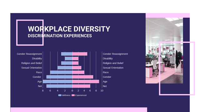
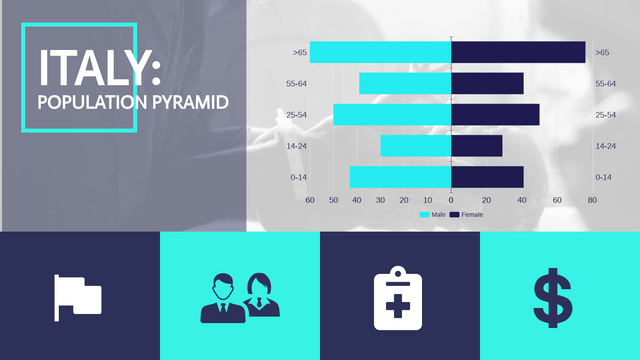
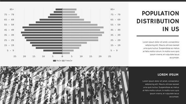
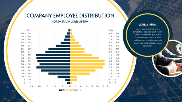
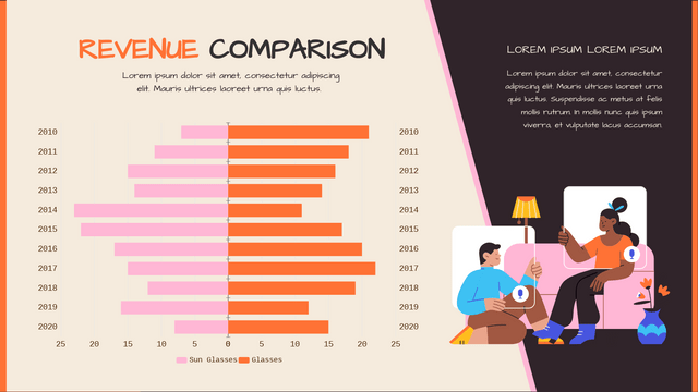
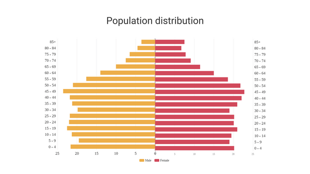
Butterfly charts, also known as back-to-back bar charts, are powerful tools for visually comparing two datasets side by side. They are particularly useful in fields such as demographic studies, market research, and survey analysis.
What is a Butterfly Chart?
A butterfly chart is a dual bar chart that displays two sets of data oriented in opposite directions, allowing for straightforward comparison. Typically, one dataset is represented with positive values on the right side, while the other is displayed with negative values on the left. This format makes it easy to identify differences between the two groups at a glance.
When to Use a Butterfly Chart
Butterfly charts are ideal for various applications, including:
- Demographic Comparisons: Analyzing age and gender distributions within a population.
- Survey Results: Comparing responses from different demographic groups.
- Financial Analysis: Visualizing budget versus actual expenditures.
Example: Butterfly Chart Visualizing Population Distribution
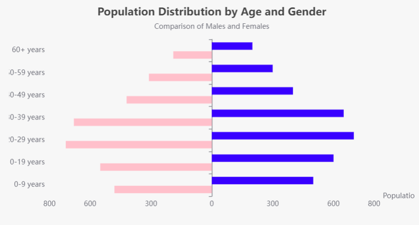
The following example illustrates a butterfly chart that visualizes the population distribution by age and gender. This chart effectively compares the number of males and females across different age groups.
Key Features of the Example
Data Structure
- Age Segmentation: The chart categorizes the population into seven age groups:
0-9,10-19,20-29,30-39,40-49,50-59, and60+. - Dual Datasets: It displays two datasets: the population of males and the population of females in each age group.
Chart Design
- Title and Subtitle: The chart features a clear title, “Population Distribution by Age and Gender,” along with a descriptive subtitle for added context.
- Axes:
- X-Axis: Represents the population count. Males are displayed as positive values on the right, while females are shown as negative values on the left, allowing for immediate visual comparison.
- Y-Axis: Lists the age groups, providing a clear categorization for the data being compared.
Color Coding
- Distinct Colors: Males are represented in blue, while females are represented in pink. This color distinction enhances readability and helps viewers quickly identify the datasets.
Interactive Tooltips
- Enhanced Engagement: Hovering over the bars reveals tooltips with detailed numerical data, improving user interaction and comprehension.
Dynamic Range
- Balanced Visualization: The x-axis ranges from -800 to 800, accommodating both genders’ populations and ensuring a visually balanced representation.
Insights Gained
- Comparative Analysis: The butterfly chart allows viewers to easily spot trends, such as which gender has a larger population in specific age groups.
- Visual Clarity: The back-to-back design provides immediate visual insights, making it easier to understand demographic differences at a glance.
Demographic Comparison Using Butterfly Charts
Demographic comparison involves analyzing and contrasting the characteristics of different population segments based on variables such as age, gender, income, and education. This analysis is essential for understanding population dynamics, trends, and disparities within specific areas or demographic groups.
Relevance to Butterfly Charts
Butterfly charts excel in facilitating demographic comparisons due to their unique design, which allows for the visualization of two related datasets side by side. In the example provided, the chart highlights key insights into the population distribution of males and females across various age groups.
Key Aspects of Demographic Comparison Using Butterfly Charts
- Segmentation:
- Age groups serve as a primary segmentation variable, clarifying how different age brackets contribute to the overall population of each gender.
- Visual Clarity:
- By positioning one dataset on the left and the other on the right, butterfly charts provide a clear visual representation that simplifies the identification of trends and discrepancies.
- Immediate Insights:
- Observers can quickly determine which gender is more populous in each age group, revealing potential demographic trends, such as aging populations or youth bulges.
- Policy Implications:
- Understanding demographic differences can inform policy decisions in areas like healthcare, education, and social services, where tailored strategies may be necessary to address the unique needs of specific populations.
- Engagement:
- The interactive nature of tools like our chart tool enhances user engagement with the data, allowing deeper exploration of demographic characteristics and encouraging personal insights.
Conclusion
Demographic comparison is fundamental to the effective use of butterfly charts. By visualizing population segments side by side, these charts facilitate a better understanding of demographic dynamics and support data-driven decision-making across various fields, including public policy, marketing, and social research. Butterfly charts not only make complex data accessible but also empower stakeholders to make informed decisions based on clear visual insights.
Discover the Best Charting Tool: Visual Paradigm Online
Looking for a powerful yet easy-to-use charting tool? Look no further! Visual Paradigm Online is your go-to solution for quickly visualizing data and statistics with our intuitive online chart maker.
Why Choose Visual Paradigm Online?
- No Credit Card Required: Get started without any commitment! Explore our features risk-free.
- 50+ Chart Types: With over 50 chart types at your fingertips, you can find the perfect representation for your data. From bar and line charts to advanced options like radar and rose charts, we’ve got you covered.
- Beautiful Chart Templates: Design stunning and professional infographics, posters, presentations, and reports effortlessly. Our wide range of templates allows you to simply replace text and data to create eye-catching visuals that are ready to share.
- Fully Customizable: Tailor your charts to fit your brand! Customize everything from colors and fonts to the positioning of titles and legends—all in just a few clicks.
- Create Charts in Minutes: Transform your data into impressive charts in no time. With our user-friendly interface, you can go from data to visualization in minutes!
Start Visualizing Today!
Unlock the potential of your data with Visual Paradigm Online. Whether you’re preparing for a presentation, crafting a report, or simply want to visualize your statistics, our chart maker is designed to meet your needs.
Explore our templates and start creating stunning charts today! Visit Visual Paradigm Online and elevate your data visualization game!
