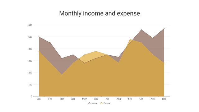
Introduction to Area Charts
Area charts are a type of data visualization that display quantitative data as an area filled with a color or pattern. They are particularly useful for visualizing trends and patterns in continuous data over time, such as sales figures, website traffic, or stock prices.
Key Features of Area Charts
- Continuous Data Representation: Area charts are designed to represent continuous data, where the x-axis typically represents a continuous scale, such as time.
- Filled Area: The area between the line and the x-axis is filled with a color or pattern, creating a visual emphasis on the quantity represented by the data.
- Trend Visualization: Area charts excel at highlighting trends, patterns, and changes in data over time, making them a valuable tool for data analysis and decision-making.
Understanding the Anatomy of an Area Chart
An area chart consists of the following key elements:
- X-axis: Represents the independent variable, typically a continuous scale such as time (e.g., days, months, years).
- Y-axis: Represents the dependent variable, which is the quantitative data being visualized (e.g., sales, website visits, stock prices).
- Filled Area: The area between the line and the x-axis is filled with a color or pattern, creating a visual emphasis on the quantity represented by the data.
- Line: The line that connects the data points, forming the boundary of the filled area.
Advantages of Using Area Charts
- Trend Identification: Area charts are highly effective at highlighting trends and patterns in data over time, making it easier to identify periods of growth, decline, or stability.
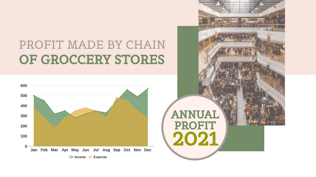
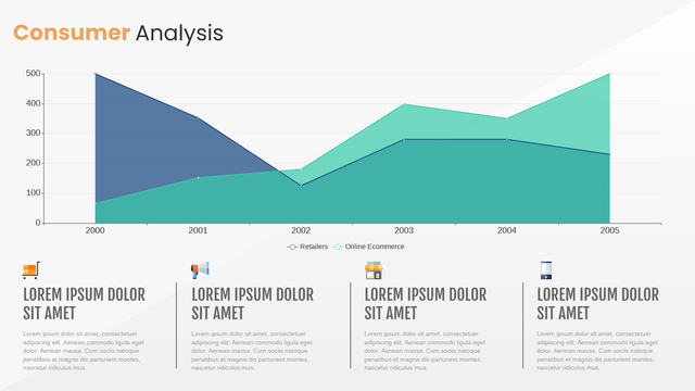
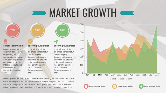
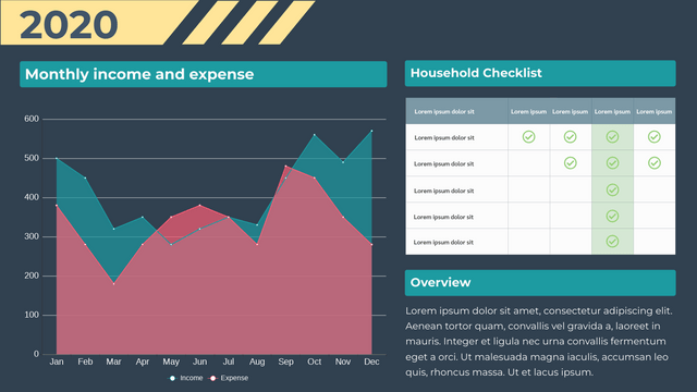
- Comparative Analysis: Multiple data series can be overlaid on the same chart, allowing for easy comparison of different metrics or categories.
- Visual Impact: The filled area creates a strong visual impact, making the data more engaging and easier to interpret at a glance.
- Percentage Representation: Area charts can be used to represent the percentage of a whole, making them useful for visualizing part-to-whole relationships.
Example: Visualizing Website Traffic Using an Area Chart
Suppose you are a digital marketing manager for a company and you want to analyze the website traffic over a 12-month period. Here’s how you can create an area chart to visualize the data:
Sample Data
| Month | Unique Visitors |
|---|---|
| Jan | 12,500 |
| Feb | 15,000 |
| Mar | 18,000 |
| Apr | 20,000 |
| May | 22,000 |
| Jun | 19,000 |
| Jul | 17,000 |
| Aug | 16,000 |
| Sep | 18,500 |
| Oct | 21,000 |
| Nov | 23,000 |
| Dec | 20,000 |
Visualizing the Data using Visual Paradigm Online
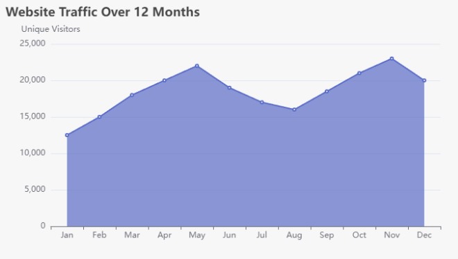
In this example, the x-axis represents the months, and the y-axis represents the number of unique visitors. The filled area between the line and the x-axis highlights the trend in website traffic over the 12-month period, making it easy to identify patterns and changes.
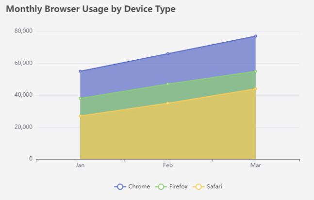
Web Browsers – Example
Sample Data
| Month | Device Type | Chrome | Firefox | Safari |
|---|---|---|---|---|
| Jan | Desktop | 20,000 | 15,000 | 10,000 |
| Jan | Mobile | 30,000 | 20,000 | 15,000 |
| Jan | Tablet | 5,000 | 3,000 | 2,000 |
| Feb | Desktop | 25,000 | 18,000 | 12,000 |
| Feb | Mobile | 35,000 | 25,000 | 20,000 |
| Feb | Tablet | 6,000 | 4,000 | 3,000 |
| Mar | Desktop | 30,000 | 20,000 | 15,000 |
| Mar | Mobile | 40,000 | 30,000 | 25,000 |
| Mar | Tablet | 7,000 | 5,000 | 4,000 |
Customizing Area Charts
Area charts can be further customized to suit your specific data visualization needs. Some common customizations include:
- Multiple Data Series: Overlaying multiple data series on the same chart to enable comparative analysis.
- Stacked Area Charts: Stacking multiple data series on top of each other to show the cumulative values.
- Transparency and Gradients: Adjusting the transparency or using gradients to create more visually appealing and informative area charts.
- Annotations and Labeling: Adding annotations, labels, or other visual elements to provide additional context and insights.
Discover Visual Paradigm Online: Your Ultimate Visual Solution
Are you in search of a robust tool to create captivating charts, diagrams, infographics, and much more? Look no further than Visual Paradigm Online!
Why Choose Visual Paradigm Online?
- Comprehensive Charting: Effortlessly craft a wide variety of charts, from basic bar and line charts to intricate stacked and radar charts. Our intuitive interface simplifies data visualization, making it accessible for everyone.
- Versatile Diagramming: Whether you need flowcharts, UML diagrams, or organizational charts, Visual Paradigm Online has you covered. Customize your diagrams with ease and share them seamlessly with your team.
- Stunning Infographics: Transform your data into striking infographics that effectively convey your message. Choose from a diverse range of templates and design elements to make your visuals truly stand out.
- Collaboration Made Simple: Collaborate with your team in real-time! Share projects, gather feedback, and make edits together, ensuring everyone is aligned and engaged.
- Cloud-Based Convenience: Access your projects anytime, anywhere. With our cloud-based platform, you can work from any device without the need for installations or complicated setups.
- User-Friendly Interface: No design experience? No problem! Our intuitive tools and templates empower anyone to create professional-quality visuals in just minutes.
Unlock Your Creative Potential
With Visual Paradigm Online, you can bring your ideas to life and communicate effectively through visuals. Whether you’re a student, educator, business professional, or designer, our platform equips you with everything you need to succeed.
Start Your Free Trial Today!
Join thousands of satisfied users and experience the ultimate solution for all your visual needs. Sign up for a free trial today and discover how Visual Paradigm Online can elevate your projects to new heights!
Visual Paradigm Online – Where Ideas Transform into Visual Masterpieces!
Conclusion
Area charts are a powerful data visualization tool that excel at highlighting trends and patterns in continuous data over time. By leveraging the filled area and the line graph, area charts create a strong visual impact that makes it easier to interpret and analyze complex data. Whether you’re tracking website traffic, sales figures, or any other continuous metric, area charts can be a valuable addition to your data visualization toolkit.
Area Charts Templates


