Introduction
Stacked line charts are a powerful way to visualize multiple data series over time or categories. Unlike standard line charts, where lines are plotted independently, stacked line charts stack the values of each series on top of one another, allowing you to see the cumulative total as well as the contribution of each category.
Key Concepts
- Data Series: Each line in a stacked line chart represents a different data series. For example, sales data for different products over several months.
- Cumulative Value: The height of each section represents the total of all previous values plus the current data series.
- Axes:
- The X-axis typically represents time or categories.
- The Y-axis represents the cumulative value.
- Color Coding: Each data series is usually represented by a different color, making it easier to distinguish between them.
Example Scenario
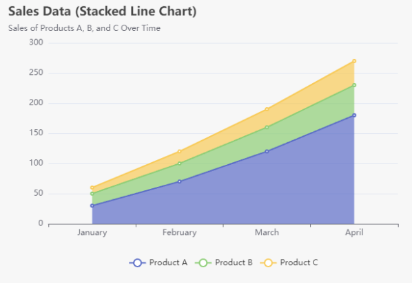
Let’s say we have sales data for three products (A, B, and C) over four months (January to April):
| Month | Product A | Product B | Product C |
|---|---|---|---|
| January | 30 | 20 | 10 |
| February | 40 | 30 | 20 |
| March | 50 | 40 | 30 |
| April | 60 | 50 | 40 |
Data Preparation
The cumulative values can be calculated as follows:
| Month | Cumulative Product A | Cumulative Product B | Cumulative Product C |
|---|---|---|---|
| January | 30 | 50 | 60 |
| February | 70 | 100 | 120 |
| March | 120 | 160 | 190 |
| April | 180 | 230 | 270 |
Visualization Using Visual Paradigm Online
Visual Paradigm Online provides a user-friendly charting tool that allows you to create various types of charts, including stacked line charts, without the need for coding. Here’s a step-by-step guide to using this tool effectively.

- Access the Tool:
- Go to the Visual Paradigm Online website and navigate to the charting tool.
- Create a New Chart:
- Click on the option to create a new chart. You may need to sign in or create an account if you haven’t already.
- Select Chart Type:
- Choose “Stacked Line Chart” from the list of available chart types. This selection will set up the chart format for your data.
- Enter Your Data:
- You will see a spreadsheet-like interface where you can input your data. For our example, enter the following data:
Month Product A Product B Product C January 30 20 10 February 40 30 20 March 50 40 30 April 60 50 40 - Customize Your Chart:
- Once you’ve entered the data, the chart will be generated automatically.
- You can customize various aspects of the chart, such as colors, labels, legends, and titles, to enhance clarity and presentation.
- Preview the Chart:
- After customization, preview the chart to ensure it meets your expectations. You can make adjustments as needed.
- Export or Share:
- Once satisfied, you can export the chart as an image or PDF, or share it directly through a link or embed code.
Interpretation of the Stacked Line Chart
The stacked line chart visualizes the sales data for three products (A, B, and C) over a four-month period (January to April). Here’s a detailed interpretation of the chart:
Key Observations
- Overall Trend:
- The overall sales trend shows a steady increase from January to April. This suggests that sales are growing for all products over this time period.
- Product Contributions:
- Product A: This product shows the highest sales figures, starting at 30 in January and rising to 60 by April. It significantly contributes to the total sales.
- Product B: Starting at 20 in January and increasing to 50 by April, Product B also shows notable growth, although its sales are consistently lower than Product A.
- Product C: This product has the lowest sales figures, beginning at 10 in January and reaching 40 in April. Despite being the smallest contributor, it still experiences growth.
- Cumulative Values:
- The chart allows us to observe the cumulative sales for all products. By looking at the top line, which represents the total sales (the sum of all products), we can see how each product’s sales add to the overall performance.
- For example, in April, the total sales amount to 270, indicating that the combined efforts of all three products have led to a significant increase in overall sales.
- Growth Rate:
- Each product shows a positive growth rate, indicating a healthy sales performance. However, the growth of Product A is particularly strong compared to the others.
- Comparative Analysis:
- The differences in sales among the three products can help in decision-making. For instance, if Product A continues to outperform the others, it might be worthwhile to focus marketing efforts on that product or analyze what contributes to its success.
The Ultimate Tool for Diagramming, Visuals and Infographic
Visual Paradigm Online emerges as the ultimate tool for creating charts, infographics, and creative visuals for several reasons:
- User-Friendly Interface: The intuitive, spreadsheet-like interface allows users to enter data easily without needing any coding skills. This accessibility makes it suitable for users of all levels.
- Variety of Chart Types: With a wide range of chart options, including stacked line charts, pie charts, bar charts, and more, users can choose the format that best represents their data.
- Customization Options: The tool offers extensive customization features, allowing users to adjust colors, labels, titles, and legend positions to create visually appealing and informative graphics.
- Real-Time Visualization: Charts are generated automatically as data is entered, providing immediate feedback and allowing users to visualize their data in real-time.
- Export and Sharing Capabilities: Users can easily export their charts as images or PDFs, or share them via links or embed codes, facilitating collaboration and presentation.
Conclusion
In this tutorial, we explored the concept of stacked line charts through a detailed example of sales data for three products over four months. We discussed key concepts such as data series, cumulative values, and the importance of axes and color coding. The stacked line chart effectively visualizes how each product contributes to total sales, offering insights into trends and comparative performance.
The stacked line chart effectively conveys the sales dynamics of Products A, B, and C over the specified months. The clear differentiation between the products, along with the cumulative totals, provides valuable insights into sales trends and the relative contribution of each product to overall performance. This visualization can guide strategic decisions, such as resource allocation and marketing focus.
Visual Paradigm Online is a powerful and versatile tool that simplifies the process of data visualization. By combining ease of use with robust features, it empowers users to create professional-quality charts and infographics that effectively communicate their insights and ideas. Whether for business presentations, educational purposes, or personal projects, this tool is an excellent choice for anyone looking to enhance their visual storytelling.
Visual Paradigm Online: High-Quality Templates for Visual Creation
Visual Paradigm Online is not only a robust charting tool but also offers a wide array of high-quality templates that cater to various areas of visual creation. These templates enhance the user experience by providing a strong foundation for users to build upon, saving time and ensuring professional results. Here’s a closer look at the benefits and offerings of these templates.
Key Features of Visual Paradigm Online Templates
- Diverse Categories:
- The tool includes templates for various purposes, such as infographics, presentations, organizational charts, mind maps, and more. This diversity makes it suitable for different fields, including business, education, marketing, and project management.
- Professional Design:
- Each template is crafted by design professionals, ensuring high aesthetic quality. Users can create visually appealing visuals that effectively communicate their messages without needing extensive design skills.
- Customizable Elements:
- Templates are fully customizable, allowing users to modify colors, fonts, layouts, and content. This flexibility ensures that visuals can be tailored to fit specific branding and messaging needs.
- Easy to Use:
- With a drag-and-drop interface, users can quickly add or remove elements from templates, making the design process intuitive and efficient. This ease of use is particularly beneficial for users who may not be familiar with graphic design software.
- Time-Saving:
- By providing ready-made templates, Visual Paradigm Online significantly reduces the time required to create high-quality visuals. Users can start with a template and focus on content rather than layout decisions.
- Collaboration Features:
- Many templates facilitate collaboration, allowing teams to work together in real-time. This is especially valuable in business environments where input from multiple stakeholders is crucial.


