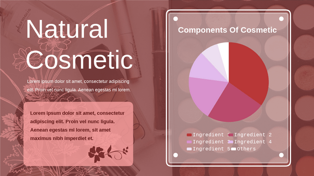
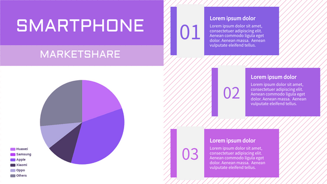
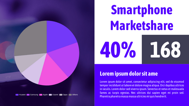
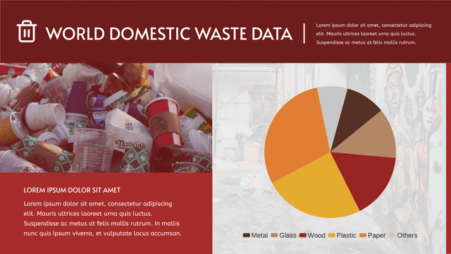
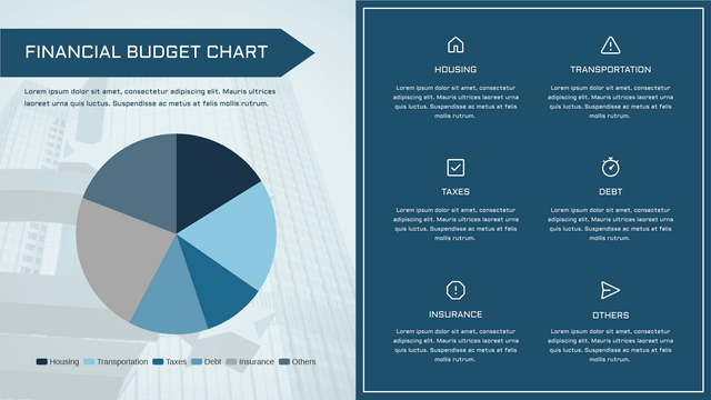
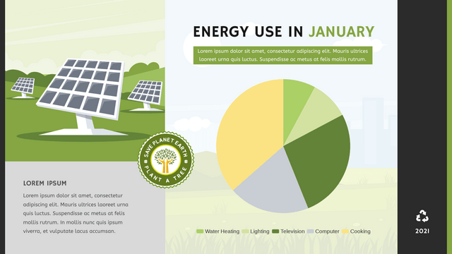
Pie charts are a popular way to visualize data, especially when you want to show the proportions of a whole. In this tutorial, we’ll cover the key concepts of pie charts, along with a realistic example, and use Visual Paradigm Online to visualize the data.
Key Concepts of Pie Charts
- Definition: A pie chart is a circular statistical graphic divided into slices to illustrate numerical proportions. Each slice represents a category’s contribution to the total.
- Data Representation: The size of each slice is proportional to the quantity it represents. The whole pie represents 100% of the data.
- Use Cases:
- Displaying market share of different companies
- Showing survey results
- Visualizing budget allocations
- Limitations:
- Hard to compare similar-sized slices
- Not effective for large datasets
- Can mislead if not properly labeled
Realistic Example: Market Share of Smartphone Brands
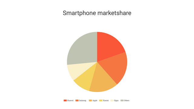
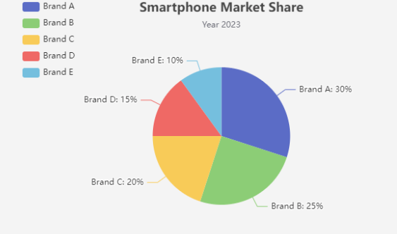
Let’s consider the market share of different smartphone brands in a given year:
- Brand A: 30%
- Brand B: 25%
- Brand C: 20%
- Brand D: 15%
- Brand E: 10%
Data Table
| Brand | Market Share (%) |
|---|---|
| Brand A | 30 |
| Brand B | 25 |
| Brand C | 20 |
| Brand D | 15 |
| Brand E | 10 |
Visualization with Visual Paradigm Online
Bar Chart vs. Pie Chart
Both bar charts and pie charts are popular methods for visualizing data, but they serve different purposes and have distinct advantages and disadvantages. Here’s a comparison of the two:
1. Definition
- Bar Chart: A bar chart displays categorical data with rectangular bars representing the value of each category. The length or height of the bar is proportional to the value it represents.
- Pie Chart: A pie chart visualizes data in a circular format, divided into slices. Each slice represents a category’s proportion to the whole.
2. When to Use
- Bar Chart:
- Best for comparing quantities across different categories.
- Ideal for datasets with many categories.
- Effective for showing changes over time if arranged chronologically.
- Pie Chart:
- Suitable for illustrating parts of a whole.
- Works well when you have a limited number of categories (usually less than five).
- Useful for showing percentage distributions.
3. Advantages
- Bar Chart:
- Easy to compare values side by side.
- Can represent both positive and negative values.
- More space-efficient for larger datasets.
- Pie Chart:
- Visually appealing and intuitive for showing relative sizes.
- Instantaneous understanding of proportions.
- Can highlight the largest or smallest categories quickly.
4. Disadvantages
- Bar Chart:
- Can become cluttered with too many categories.
- Requires more space than pie charts for the same amount of data.
- Pie Chart:
- Difficult to compare similar-sized slices.
- Can be misleading if not properly labeled or if the data is complex.
- Not effective for depicting changes over time.
5. Example Comparison
Bar Chart Example
Imagine you want to compare sales of different fruits in a store:
| Fruit | Sales ($) |
|---|---|
| Apples | 150 |
| Bananas | 100 |
| Cherries | 75 |
| Dates | 50 |
A bar chart would clearly show that apples have the highest sales, followed by bananas, cherries, and dates.
Pie Chart Example
If you want to show the market share for different smartphone brands:
| Brand | Market Share (%) |
|---|---|
| Brand A | 30 |
| Brand B | 25 |
| Brand C | 20 |
| Brand D | 15 |
| Brand E | 10 |
A pie chart would effectively illustrate the proportion each brand contributes to the total market share.
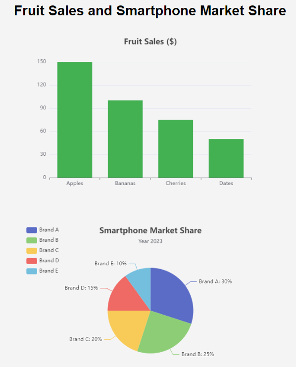
Choosing between a bar chart and a pie chart depends on the data you want to present and the message you want to convey. For comparing quantities, bar charts are typically more effective, while pie charts are better for illustrating parts of a whole. Always consider the audience and the data’s complexity when deciding which chart to use.
Conclusion
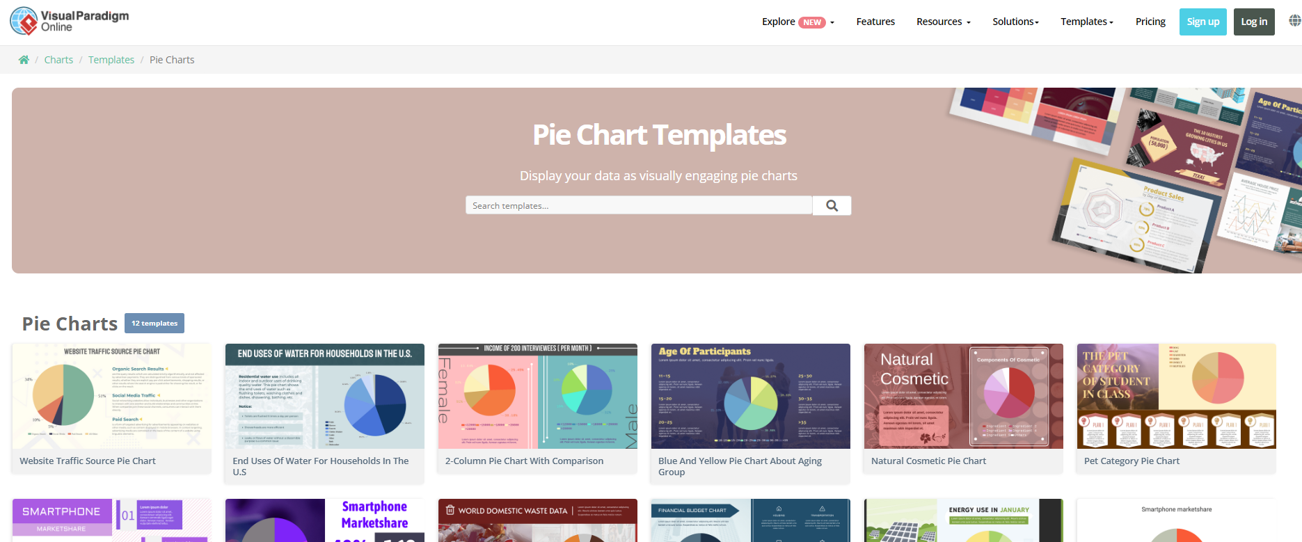
Pie charts are effective for visualizing proportions in a dataset. However, it’s essential to use them judiciously, considering their limitations. The Visual Paradigm Online Template library makes it easy to create interactive visualizations. You can modify the example to fit different datasets as needed.
Pie Charts Templates
