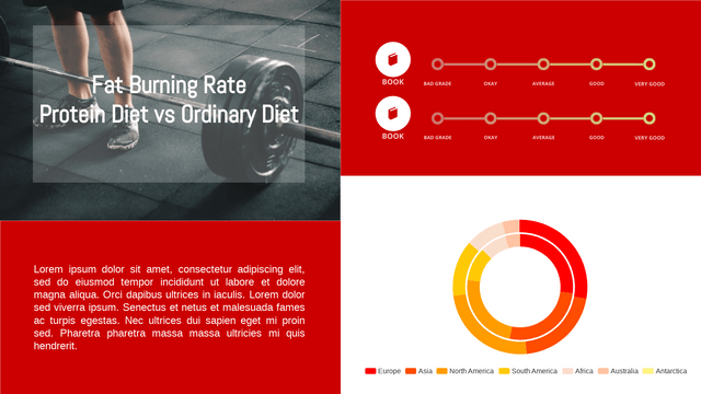
Double Doughnut Charts (also known as comparative Doughnut Charts) are a useful way to visualize hierarchical data in a circular format, allowing viewers to compare two datasets side by side. This tutorial will guide you through the key concepts of Double Doughnut Charts, provide a realistic example, and show how to implement it using Visual Paradigm Online Chart Tool.

Key Concepts
- Doughnut Chart: A doughnut chart is a variation of a pie chart, where the center is cut out, allowing for additional information to be displayed.
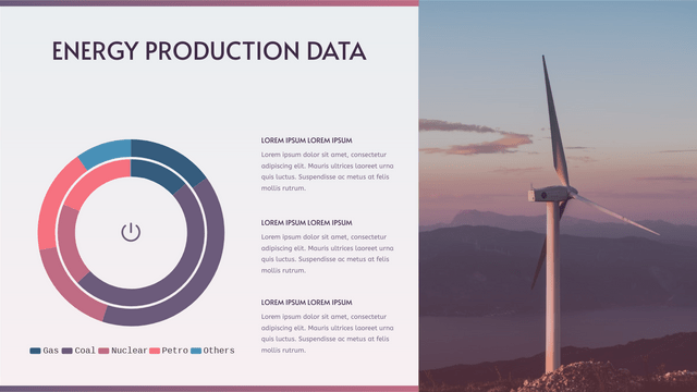
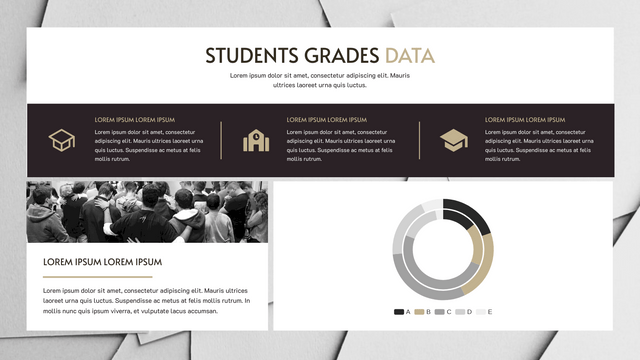
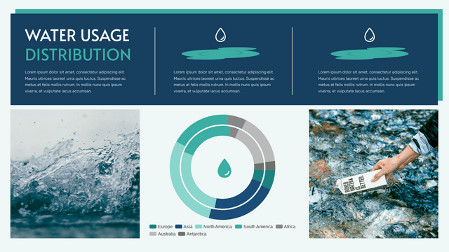
- Double Doughnut: This consists of two concentric doughnut charts, usually representing two related datasets. It enables comparisons between the two datasets, making it easier to identify patterns and relationships.
- Use Cases: Double Doughnut Charts are excellent for:
- Comparing two related categories.
- Showing distribution of a whole into parts.
- Visualizing demographic data, budget allocations, or survey results.
Example Scenario
Let’s consider a company that wants to visualize its sales and expenses across different departments. We will create a Double Doughnut Chart to compare sales and expenses in three departments: Marketing, Sales, and Development.
Data Structure
Here’s the sample data we will use:
- Sales Data:
- Marketing: $50,000
- Sales: $70,000
- Development: $30,000
- Expense Data:
- Marketing: $30,000
- Sales: $50,000
- Development: $20,000
Implementing Double Doughnut Chart with Visual Paradigm Online
Description of the Double Donut Chart
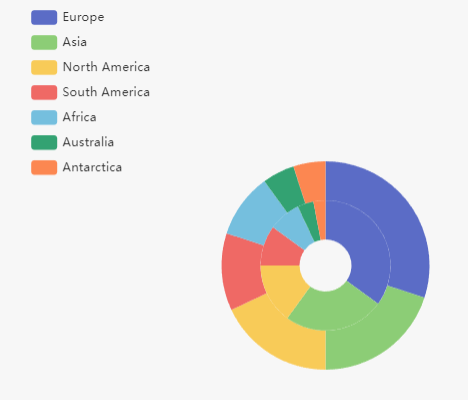
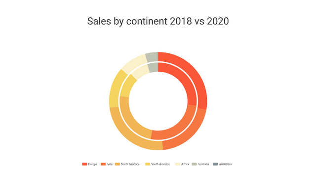
The comparative donut chart visualizes sales data by continent for the years 2018 and 2020. This chart effectively highlights changes in sales distribution across different regions over the specified period.
- Outer Donut (2018): The outer ring represents the sales figures for each continent in 2018. Each segment’s size corresponds to the proportion of total sales attributed to that continent, allowing for quick visual comparisons.
- Inner Donut (2020): The inner ring illustrates the sales figures for 2020. Similar to the outer donut, the size of each segment reflects the sales contribution from each continent, enabling viewers to see how sales have shifted over the two years.
Key Insights:
- Growth in Europe and Asia: Both Europe and Asia show an increase in sales from 2018 to 2020.
- Decline in North America: North America experienced a decrease in sales during the same period.
- Stable Sales in Africa and Australia: Sales in Africa and Australia showed only minor changes, indicating relative stability.
This chart serves as a powerful tool for analyzing trends in global sales, helping stakeholders make informed decisions based on regional performance over the specified years.
Double Doughnut Chart vs Grouped Column Chart
When comparing a doughnut chart and a grouped column chart, both visualizations serve different purposes and have unique characteristics. Here’s a comparative overview:
Doughnut Chart
Advantages:
- Visual Appeal: The circular shape can be more visually engaging and can fit well into designs.
- Part-to-Whole Relationships: It effectively shows the proportion of parts to a whole, making it easy to understand contributions to a total.
- Space for Labels: The center of the doughnut can be used for additional information or totals.
Disadvantages:
- Limited Data Comparison: It’s less effective for comparing multiple categories or values directly.
- Difficult for Precise Values: Readers may struggle to gauge exact values compared to bar heights in a column chart.
Grouped Column Chart
Advantages:
- Direct Comparison: It allows for easy comparison of multiple categories across different groups, making it clear which category performs better.
- Exact Values: It’s easier to read and interpret exact values due to the vertical bars.
- Clear Trends: Trends over categories or time can be represented clearly.
Disadvantages:
- Space Constraints: Can become cluttered if there are too many categories or groups, especially on smaller screens.
- Less Visually Appealing: May not be as visually engaging as a doughnut chart for some audiences.
Use Cases
- Doughnut Chart: Best for displaying market share, budget breakdowns, or any scenario where you want to show how parts contribute to a whole.
- Grouped Column Chart: Ideal for comparing performance metrics across different categories, such as sales by region or product performance over time.
Choosing between a doughnut chart and a grouped column chart depends on the data you want to present and the story you wish to tell. For part-to-whole relationships, a doughnut chart may be more effective, while for comparative analysis, a grouped column chart is often the better choice.
Here are realistic examples for both a doughnut chart and a grouped column chart to illustrate their use cases clearly.
Example Scenario: Annual Sales Data for a Retail Company
Data Context: A retail company sells three product categories: Electronics, Clothing, and Home Goods. The company wants to analyze its sales performance for the year across different quarters.
1. Doughnut Chart Example
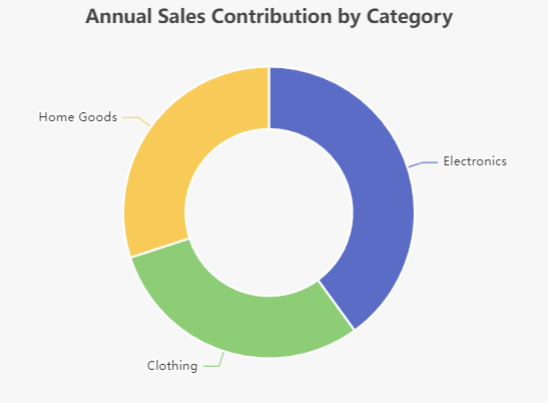
Purpose: To show the proportion of total sales contributed by each product category for the entire year.
Data:
- Total Sales: $1,000,000
- Electronics: $400,000 (40%)
- Clothing: $300,000 (30%)
- Home Goods: $300,000 (30%)
Doughnut Chart:
- The chart will visually display the slices representing each category’s contribution to the total sales, helping stakeholders quickly understand which categories are performing best.
2. Grouped Column Chart Example
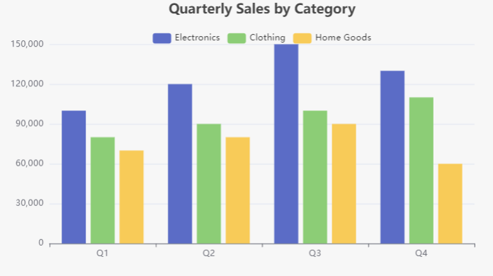
Purpose: To compare quarterly sales across the three product categories.
Data:
- Quarter 1:
- Electronics: $100,000
- Clothing: $80,000
- Home Goods: $70,000
- Quarter 2:
- Electronics: $120,000
- Clothing: $90,000
- Home Goods: $80,000
- Quarter 3:
- Electronics: $150,000
- Clothing: $100,000
- Home Goods: $90,000
- Quarter 4:
- Electronics: $130,000
- Clothing: $110,000
- Home Goods: $60,000
Grouped Column Chart:
- Each quarter will have a set of three columns (one for each product category), allowing for direct comparison of sales performance across quarters and categories.
- Doughnut Chart: Best for visualizing the overall contribution of each product category to total sales for the year.
- Grouped Column Chart: Best for comparing how each product category performed across different quarters, highlighting trends and variations in sales.
You have successfully created a Double Doughnut Chart using Visual Paradigm Online to visualize sales and expenses by department. This visualization allows for easy comparison of two datasets, providing insights into the company’s financial performance. You can further customize the chart with colors, additional data, and styles as needed.
Double Doughnut Charts Templates
Visual Paradigm offers a variety of chart templates that can enhance your ability to visualize data effectively. Here are some examples of how to use different chart templates for various purposes:
1. Pie Chart
Use Case: Market Share Analysis
Description: A pie chart can illustrate the market share of different companies within an industry. Each slice represents a company’s share, making it easy to compare their relative sizes.
2. Bar Chart
Use Case: Sales Performance Comparison
Description: A bar chart can be used to compare sales performance across different products or regions. Each bar represents a product or region, allowing for straightforward comparison of sales figures.
3. Line Chart
Use Case: Trend Analysis over Time
Description: A line chart is ideal for showing trends over time, such as monthly sales figures over several years. Each line can represent a different product or region, making it easy to identify trends and patterns.
4. Stacked Bar Chart
Use Case: Cumulative Sales Analysis
Description: A stacked bar chart can show the cumulative sales for different products across various regions. Each segment of the bar represents a product’s contribution to total sales, allowing for a clear visualization of how each product performs.
5. Radar Chart
Use Case: Performance Evaluation
Description: A radar chart can be utilized to evaluate multiple performance metrics for different teams or departments. Each axis represents a different metric, providing a comprehensive view of strengths and weaknesses.
6. Donut Chart
Use Case: Budget Allocation
Description: A donut chart is effective for visualizing budget allocations across various departments. The central space can be used for additional information, such as total budget or a key metric.
7. Bubble Chart
Use Case: Market Size and Growth
Description: A bubble chart can depict the relationship between market size, growth rate, and market share for different companies. Each bubble’s size represents market size, while its position reflects growth and share.
Using Visual Paradigm Templates
To create these charts using Visual Paradigm:
- Select a Template: Choose the appropriate chart template from the Visual Paradigm library.
- Input Data: Enter your data into the template, ensuring that it is organized correctly for the chart type.
- Customize Design: Modify colors, labels, and other design elements to enhance readability and visual appeal.
- Analyze and Share: Utilize the chart for presentations or reports, making data-driven decisions easier for stakeholders.
These examples showcase how different chart types can be applied to various scenarios, helping communicate data insights clearly and effectively.
