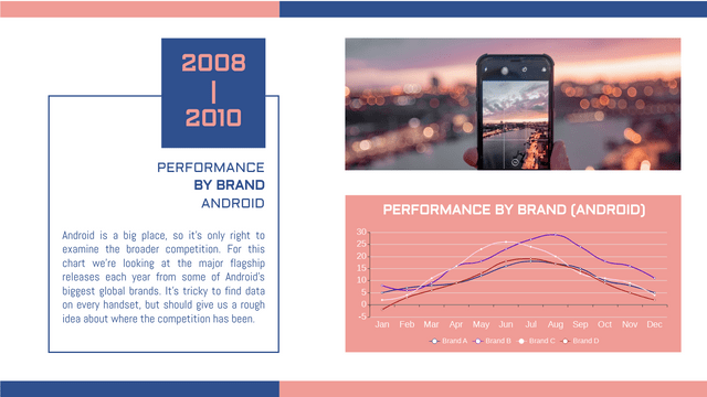
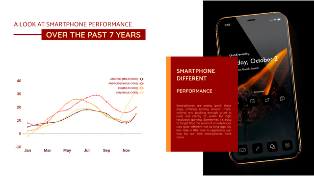
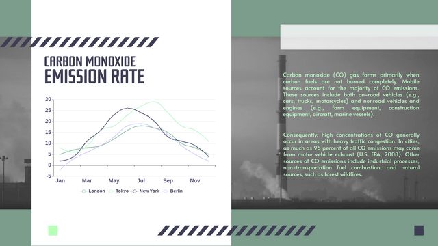
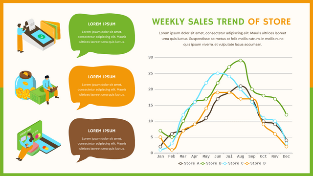
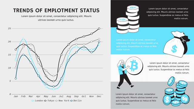
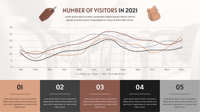
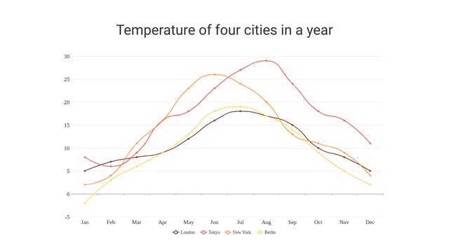
Curved line charts are a powerful way to visualize data that changes over time or across a continuous variable. Unlike traditional straight-line charts, curved line charts provide a smoother representation of trends, making it easier to identify patterns and fluctuations.
Key Concepts
1. Data Representation
- X and Y Axes: The X-axis usually represents time or categories, while the Y-axis represents the values being measured.
- Data Points: Individual observations plotted on the chart.
- Curves: The lines connecting the data points can be smoothed to create a continuous curve.
2. Smoothing Techniques
- Bezier Curves: A mathematical method to create smooth curves.
- Spline Interpolation: A form of interpolation that uses piecewise polynomials to create smooth curves between data points.
3. Use Cases
- Visualizing trends in stock prices, temperature changes, or any data where continuity is important.
- Comparing multiple datasets to show how they relate to each other over time.
4. Advantages
- Enhanced readability of trends.
- Better visual appeal compared to straight lines.
- Can reveal underlying patterns that may not be obvious in a standard line chart.
Example: Monthly Sales Data
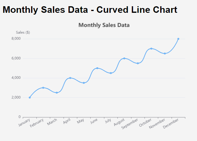
Let’s consider a realistic example where we visualize the monthly sales data of a fictional company over one year.
Monthly Sales Data
| Month | Sales (in $) |
|---|---|
| January | 2000 |
| February | 3000 |
| March | 2500 |
| April | 4000 |
| May | 3500 |
| June | 5000 |
| July | 4500 |
| August | 6000 |
| September | 5500 |
| October | 7000 |
| November | 6500 |
| December | 8000 |
Visualize the Data with Visual Paradigm Online Charting
Review of the Chart
- Title and Labels: The chart includes a clear title and axis labels, making it easy to understand what the data represents.
- Smooth Curves: The
smooth: trueproperty creates a visually appealing curve that connects the data points seamlessly. - Interactivity: The tooltip feature allows users to hover over data points for precise values, enhancing user experience.
- Responsive Design: The chart is designed to be responsive, adjusting to the width of the screen.
Multiple Lines Chart Example
Let’s create an example of a line chart that compares the monthly sales data of five different products over the same year. This will demonstrate how to visualize multiple lines in a single chart using Visual Paradigm Online Charting Tool.
Example: Monthly Sales Comparison of Five Products
Monthly Sales Data
| Month | Product A (in $) | Product B (in $) | Product C (in $) | Product D (in $) | Product E (in $) |
|---|---|---|---|---|---|
| January | 2000 | 1500 | 1800 | 2200 | 1700 |
| February | 3000 | 2500 | 2000 | 2800 | 2100 |
| March | 2500 | 2000 | 2400 | 2600 | 1900 |
| April | 4000 | 3500 | 3000 | 3200 | 3500 |
| May | 3500 | 4500 | 4000 | 3700 | 3800 |
| June | 5000 | 6000 | 5500 | 5200 | 4900 |
| July | 4500 | 5500 | 5300 | 5800 | 5100 |
| August | 6000 | 7000 | 6500 | 6900 | 6200 |
| September | 5500 | 6500 | 6000 | 6200 | 5800 |
| October | 7000 | 8000 | 7800 | 7400 | 7200 |
| November | 6500 | 7500 | 7000 | 6800 | 6700 |
| December | 8000 | 9000 | 8500 | 8300 | 8100 |
Key Features of the Updated Chart
- Legend Positioning: The legend is now positioned at the bottom of the chart for better visibility and aesthetics.
- Increased Spacing: The y-axis interval is adjusted to create more visual separation between the lines, making it easier to compare sales figures.
- Smooth Lines: Each line remains smooth for a polished look, enhancing readability.
- Tooltips: Hovering over the lines will still display specific sales figures for each product.
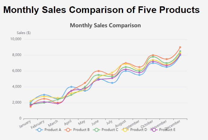
This multiple lines example effectively compares the monthly sales of five products using a line chart. By adjusting the layout and spacing, we improve the chart’s readability and overall presentation. Visual Paradigm Online Charting tool allows you to create interactive and visually appealing charts that communicate your data clearly.
Unlock Your Creativity with Visual Paradigm Online!
Are you looking for the ultimate tool to elevate your data visualization game? Look no further than Visual Paradigm Online! Whether you’re crafting stunning charts, infographics, or other creative visuals, Visual Paradigm Online offers everything you need to bring your ideas to life.
Why Choose Visual Paradigm Online?
- User-Friendly Interface: Create beautiful visuals in minutes, no design skills required!
- Diverse Chart Options: From line charts to pie charts and everything in between, customize your data presentations effortlessly.
- Infographic Maker: Transform complex information into engaging infographics that captivate your audience.
- Collaboration Features: Work with your team in real-time, ensuring everyone is on the same page.
- Cloud-Based Access: Design from anywhere, anytime—no downloads necessary!
Perfect for Every Professional
Whether you’re a marketer, educator, or business analyst, Visual Paradigm Online empowers you to communicate your message effectively. Enhance your articles, reports, and presentations by integrating high-quality visuals that resonate with your audience.
Get Started Today!
Don’t miss the chance to revolutionize your creative process. Explore the full potential of Visual Paradigm Online and start crafting visuals that make an impact.
👉 Try Visual Paradigm Online Now!
Transform your data into compelling stories and elevate your projects with the power of visual communication!

