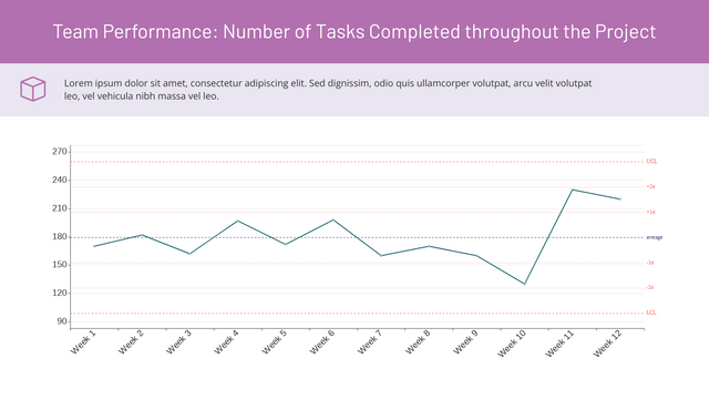
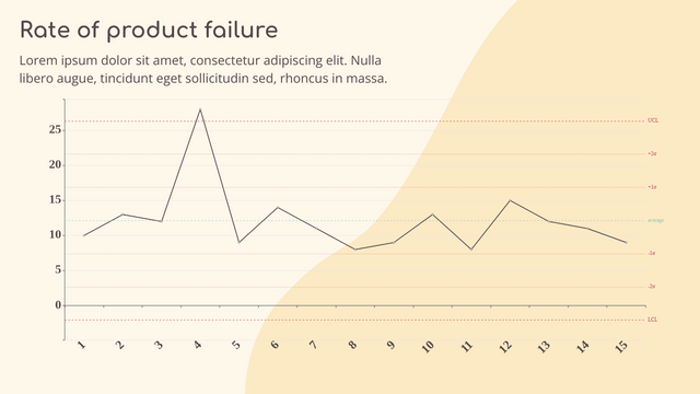
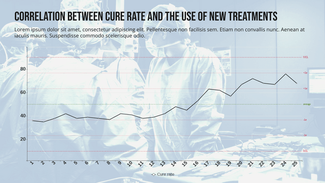
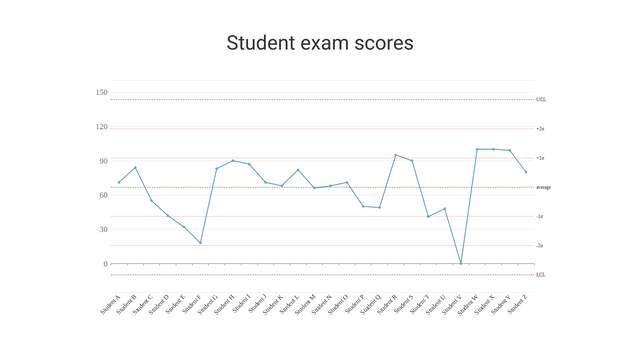
What is a Control Chart?
A Control Chart is a statistical tool used in quality management and statistical process control (SPC) to monitor and analyze process data over time. It helps identify variations in a process, detect trends or patterns, and determine whether a process is operating within control limits. By using control charts, organizations can gain valuable insights into process performance and maintain consistent quality standards.
Importance of Control Charts
- Detect Variations: Control charts help distinguish between common cause variation (inherent to the process) and special cause variation (due to external factors).
- Identify Trends: They allow for the identification of trends or patterns that may indicate a shift in the process.
- Maintain Quality: By monitoring processes, organizations can take corrective action before defects occur, ensuring consistent quality.
Creating Control Charts with VP Online Control Chart Maker
Creating control charts is made simple and efficient with the VP Online Control Chart Maker. Here’s how to get started:
Step 1: Access the Control Chart Maker
- Go to the VP Online Control Chart Maker.
- Sign up or log in to your account.
Step 2: Input Your Data
- Data Entry: Enter your process data into the provided fields. This data could include measurements or counts for the process you are monitoring.
- Data Format: Ensure your data is formatted correctly, typically in a time series format with relevant measurements.
Step 3: Select a Control Chart Template
- Template Library: Browse the template library within the control chart maker.
- Choose a Template: Select a pre-designed control chart template that fits your specific needs. This saves time and provides a professional layout.
Step 4: Customize Your Control Chart
- Customization Options: Modify the chart to suit your data and design preferences. You can adjust colors, labels, titles, and chart types (e.g., X-bar, R-chart, P-chart).
- Add Control Limits: Input your upper and lower control limits to visualize the acceptable range for your process data.
Step 5: Finalize and Export Your Control Chart
- Review Your Chart: Ensure all data is correctly displayed, and the chart meets your requirements.
- Export Options: Choose how to export your control chart. You can save it as an image file (e.g., PNG, JPG) or in flipbook format for easy sharing.
- Print Options: If physical copies are needed, you can print the control chart directly from the platform.
Benefits of Using VP Online Control Chart Maker
- Time-Saving: Quickly create professional-looking control charts without starting from scratch.
- Customization: Tailor templates to fit specific data and design requirements, ensuring relevance to your organization’s needs.
- Collaboration: Easily share and disseminate control charts, facilitating communication among team members and stakeholders.
Control Chart Example
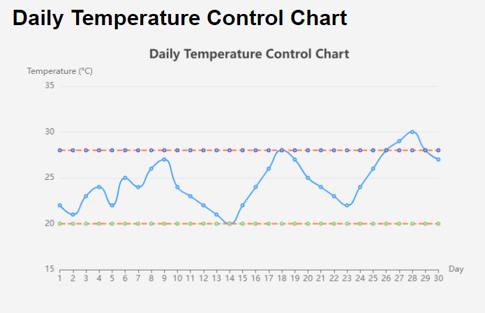
Let’s create an example of a control chart to monitor the daily temperature in a manufacturing facility over a month. This control chart will help identify if the temperature remains within acceptable limits for optimal production conditions.
Example: Daily Temperature Control Chart
Daily Temperature Data (°C)
| Day | Temperature |
|---|---|
| 1 | 22 |
| 2 | 21 |
| 3 | 23 |
| 4 | 24 |
| 5 | 22 |
| 6 | 25 |
| 7 | 24 |
| 8 | 26 |
| 9 | 27 |
| 10 | 24 |
| 11 | 23 |
| 12 | 22 |
| 13 | 21 |
| 14 | 20 |
| 15 | 22 |
| 16 | 24 |
| 17 | 26 |
| 18 | 28 |
| 19 | 27 |
| 20 | 25 |
| 21 | 24 |
| 22 | 23 |
| 23 | 22 |
| 24 | 24 |
| 25 | 26 |
| 26 | 28 |
| 27 | 29 |
| 28 | 30 |
| 29 | 28 |
| 30 | 27 |
Control Limits
- Upper Control Limit (UCL): 28°C
- Lower Control Limit (LCL): 20°C
Explanation of the Chart Components
- Title and Tooltip: The chart includes a title and tooltips for better context when hovering over data points.
- X-Axis: Represents the days of the month, providing a clear timeline for the data.
- Y-Axis: Displays the temperature in degrees Celsius, with defined minimum and maximum values for context.
- Temperature Data: The main line represents the daily temperature readings.
- Control Limits: The upper and lower control limits are displayed as dashed lines, indicating the acceptable temperature range.
Conclusion
Control charts are invaluable tools in quality management and statistical process control. With the VP Online Control Chart Maker, creating and customizing control charts is efficient and straightforward. By leveraging the template library and easy export options, you can enhance your process monitoring and maintain high-quality standards in your organization.
This control chart effectively visualizes the daily temperature data, allowing users to quickly assess whether the temperature remains within acceptable limits. By using Visual Paradigm Online, you can create interactive and visually appealing control charts to monitor processes and maintain quality standards.
Get Started Today!
Explore the power of control charts for your organization by using the VP Online Control Chart Maker. Start monitoring your processes effectively and ensure consistent quality in your operations!
