Overview
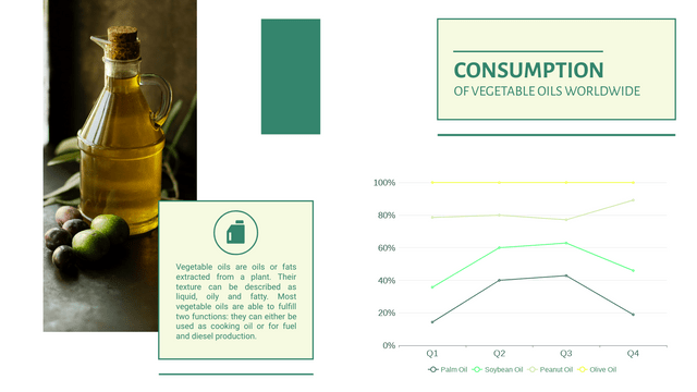
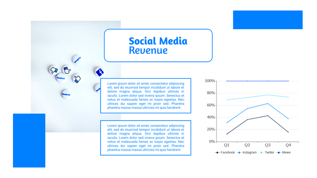
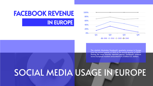
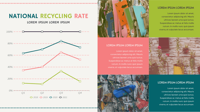
A 100% Stacked Line Chart is a great way to visualize relative proportions of different categories over time. Unlike standard line charts, which show absolute values, a 100% stacked line chart displays the percentage contribution of each category, making it easier to compare trends across multiple groups.
A 100% Stacked Line Chart is particularly useful in various scenarios where you want to visualize the relative proportions of different categories over a specific period. Here are some key situations when to use this type of chart:
- Market Share Analysis:
- To show how different brands or products compete in terms of market share over time. This allows for easy comparison of how each entity’s share changes relative to the total market.
- Sales Distribution:
- When analyzing the sales distribution of multiple products across different regions or time periods, helping stakeholders understand which products are gaining or losing traction.
- Survey Results:
- To display survey responses or preferences across different demographics or time frames, showing how opinions shift over time.
- Resource Allocation:
- In project management, to visualize how resources (time, budget, personnel) are allocated among different tasks or projects over a timeline.
- Performance Metrics:
- For tracking key performance indicators (KPIs) across various departments or teams, illustrating how each contributes to the overall performance.
- Education and Training:
- To present student performance across various subjects or courses over time, highlighting shifts in strengths and weaknesses.
- Social Trends:
- To visualize changes in social media engagement, public opinion, or other trends over time, providing insights into how different segments of the population are evolving.
Benefits of Using a 100% Stacked Line Chart
- Relative Comparison: Easily compare the contributions of different categories without getting bogged down in absolute numbers.
- Visual Clarity: Provides a clear visual representation of trends and changes, making it easier to communicate insights.
- Focus on Proportions: Emphasizes how categories interact with one another, which is valuable for strategic decision-making.
Example Scenario
Let’s say we’re analyzing the market share of three smartphone brands (Brand A, Brand B, and Brand C) over five years (2019 to 2023). This will allow us to see how each brand’s market share changes over time, relative to the total market.
Key Concepts
- Data Representation: Each line will represent a brand’s market share as a percentage of the total market for each year.
- Normalization: The total for each year will sum to 100%, allowing for easy comparison.
- Visual Clarity: Using different colors for each brand helps distinguish the lines.
Sample Data
Here’s the market share data for our example:
| Year | Brand A | Brand B | Brand C |
|---|---|---|---|
| 2019 | 40% | 35% | 25% |
| 2020 | 30% | 40% | 30% |
| 2021 | 25% | 30% | 45% |
| 2022 | 35% | 25% | 40% |
| 2023 | 45% | 30% | 25% |
Visualize 100% Stacked Line Chart with Visual Paradigm Online
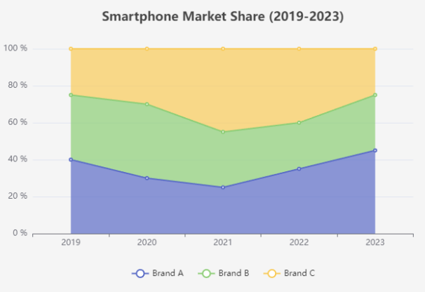
Use a 100% Stacked Line Chart when you want to convey how parts contribute to the whole over time, allowing for clear comparisons and insights across multiple categories or groups.
🌟 Unlock Your Creativity with Visual Paradigm Online! 🌟
Are you tired of clunky diagramming tools that limit your creativity? Say hello to Visual Paradigm Online—the ultimate solution for all your diagramming, charting, and creative visual design needs!
Why Choose Visual Paradigm Online?
- User-Friendly Interface: Create stunning visuals effortlessly with our intuitive drag-and-drop functionality. No design experience? No problem!
- Diverse Diagramming Options: From UML and flowcharts to mind maps and org charts, our extensive library of templates and symbols has you covered.
- Real-Time Collaboration: Work seamlessly with your team, no matter where they are. Share your designs and get instant feedback in real time.
- Cloud-Based Flexibility: Access your projects anytime, anywhere. All you need is an internet connection to bring your ideas to life!
- Creative Visual Design Tools: Enhance your diagrams with customizable colors, shapes, and styles. Make your visuals pop and convey your message effectively!
Perfect for Everyone!
Whether you’re a student, business professional, or creative designer, Visual Paradigm Online is tailored to meet your needs. Transform your ideas into impactful visuals with ease!
Get Started Today!
Join thousands of satisfied users and elevate your diagramming game. Try Visual Paradigm Online for free and discover the power of visual communication!
Unleash your creativity and make your ideas shine with Visual Paradigm Online! 🌈✨
