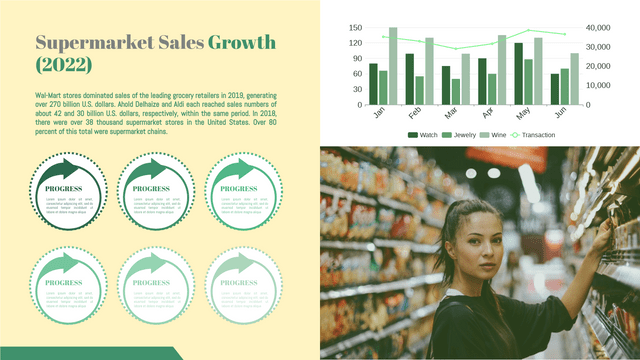
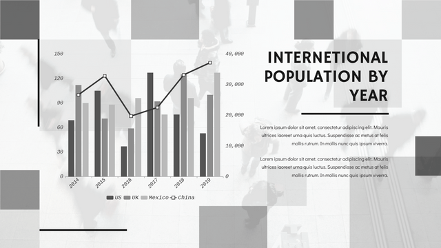
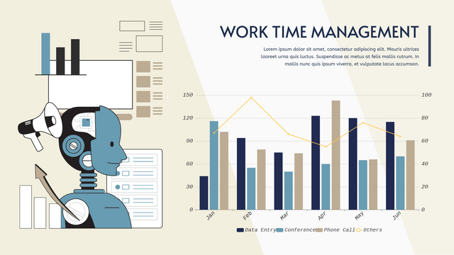
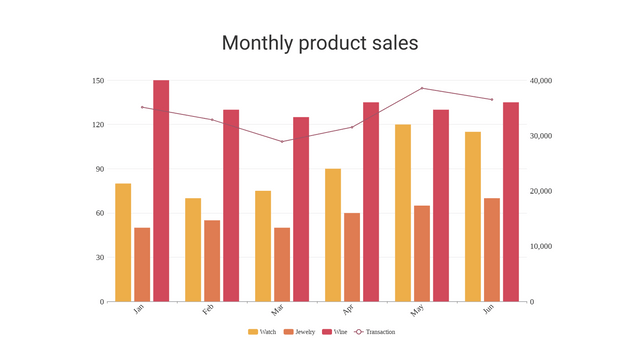
In this tutorial, we will create a grouped column and line chart using Visual Paradigm Online to visualize sales data for different products over several months. This type of chart is useful for comparing quantities across categories while also displaying trends over time.
Key Concepts
Grouped Column Chart
A grouped column chart allows us to display different categories (e.g., products) for each time period (e.g., months). Each category is represented as a column, and we can easily compare the values.
Line Chart
A line chart is excellent for showing trends over time. By overlaying a line chart on top of the grouped column chart, we can visualize the total sales trend.
Example Scenario
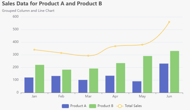
Let’s consider a hypothetical company that sells two products: Product A and Product B. We will visualize their monthly sales data over the first six months of the year and also show the total sales trend.
Sales Data
| Month | Product A | Product B |
|---|---|---|
| Jan | 120 | 220 |
| Feb | 132 | 182 |
| Mar | 101 | 191 |
| Apr | 134 | 234 |
| May | 90 | 290 |
| Jun | 230 | 330 |
The total sales for each month is calculated as follows:
- Total Sales = Product A + Product B
| Month | Total Sales |
|---|---|
| Jan | 340 |
| Feb | 314 |
| Mar | 292 |
| Apr | 368 |
| May | 380 |
| Jun | 560 |
Creating Grouped Column and Line Chart with Visual Paradigm
Result
You should see a grouped column and line chart displaying the sales data for Product A and Product B, along with the total sales trend over the first six months of the year.
When to Use a Grouped Column Chart
A grouped column chart (also known as a clustered column chart) is a powerful visualization tool that can effectively convey comparisons across categories. Here are some specific scenarios and problems for which a grouped column chart is particularly well-suited:
1. Comparing Multiple Categories Across Common Groups
- Example: Comparing sales figures of different products within the same time frame (e.g., months, quarters).
- Use Case: A company wants to analyze how different products performed over several months.
2. Visualizing Changes Over Time
- Example: Tracking performance metrics (like revenue, clicks, or conversions) of different marketing campaigns over different periods.
- Use Case: A marketing team assesses the effectiveness of campaigns across various months.
3. Analyzing Survey Results
- Example: Comparing responses from different demographics to survey questions.
- Use Case: A research organization wants to visualize how different age groups responded to a survey.
4. Displaying Performance Metrics
- Example: Comparing key performance indicators (KPIs) across different departments or teams within an organization.
- Use Case: A manager wants to evaluate the performance of sales teams across different regions.
5. Showing Composition of Total Values
- Example: Understanding the breakdown of total sales by product category across different time periods.
- Use Case: A business examines how each product contributes to overall sales.
6. Facilitating Quick Comparisons
- Example: Providing a visual representation that makes it easy to compare values at a glance.
- Use Case: A dashboard showing sales performance across multiple stores for quick insights.
Advantages of Grouped Column Charts
- Clarity: They clearly show the relationship between categories and groups, making it easy to spot trends and differences.
- Easy Interpretation: Viewers can quickly interpret the data without needing to analyze complex numbers.
- Flexibility: They can accommodate multiple datasets, allowing for comprehensive comparisons.
Limitations
- Complexity with Too Many Categories: If there are too many groups or categories, the chart can become cluttered and difficult to read.
- Limited to Two Dimensions: Grouped column charts are primarily two-dimensional, which may not capture all nuances of complex datasets.
🎉 Promote Your Data Insights with Grouped Column and Line Chart Templates! 📊
Are you looking to visualize multiple datasets in a single, cohesive chart? Look no further! Our Grouped Column and Line Chart Templates are the perfect solution for displaying complex data in an easily digestible format.
Why Choose Grouped Column and Line Charts?
Grouped column and line charts are highly effective for comparing data across various categories. By combining both column and line charts, these visuals allow you to:
- Easily Compare Multiple Data Sets: View two or more columns and lines side-by-side or stacked for instant insights.
- Highlight Trends and Relationships: Perfect for identifying correlations, such as sales revenue versus profits over time or temperature against precipitation.
Common Applications
These charts are invaluable in various fields, including:
- Business: Analyze quarterly sales revenue and profits to strategize for future growth.
- Finance: Visualize stock performance alongside market indices for better investment decisions.
- Science: Display relationships between environmental factors, like temperature and precipitation, over time.
Easy Creation with VP Online
With VP Online, creating a grouped column and line chart is a breeze! Our user-friendly chart maker allows you to:
- Customize Effortlessly: Add or remove data series, change colors, and adjust axes to fit your needs.
- Export with Ease: Share your insights seamlessly by exporting charts in various formats, including PNG and PDF.
- Explore Our Template Library: Get inspired with a variety of grouped column and line chart examples to kickstart your project.
Get Started Today!
Don’t miss out on the opportunity to enhance your data visualization skills. Start creating stunning grouped column and line charts now and make your data speak volumes!
👉 Start Your Creation with VP Online!
Transform your data into impactful visuals and share your insights effectively!
Conclusion
In this tutorial, you learned how to create a grouped column and line chart using Visual Paradigm. This visualization effectively compares sales data across different products while showing the overall sales trend, making it easier to analyze performance over time. You can customize the chart further by modifying colors, labels, and other properties to suit your needs.
Grouped column charts are ideal for comparing multiple datasets across common categories, especially when you need to display trends or changes over time. They are effective tools for data analysis in various fields, such as business, marketing, and research. When designing your visualizations, consider the amount of data and the clarity of presentation to ensure that your audience can easily understand the insights being communicated.
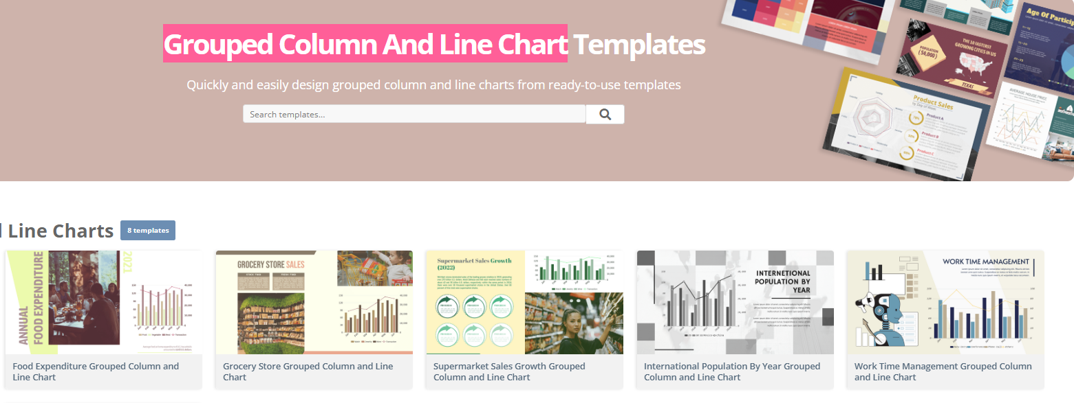
Grouped Column and Line Charts Templates


