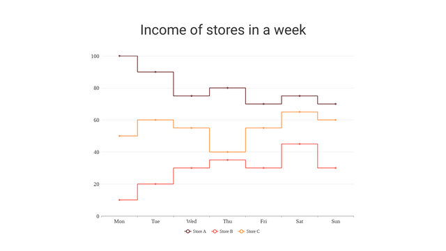
What is a Step Chart?
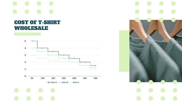
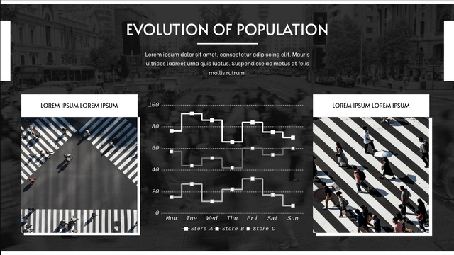
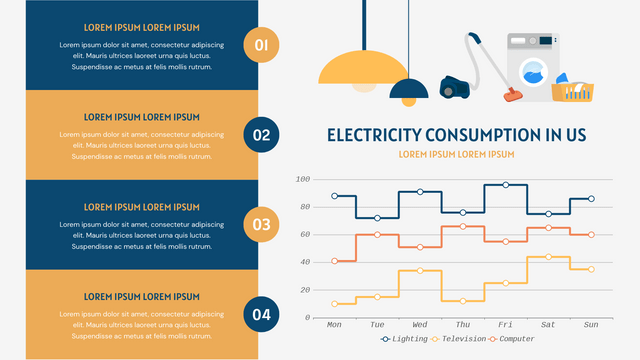
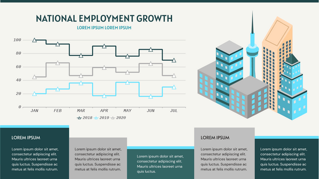
A step chart is a type of data visualization that displays data points in a way that emphasizes changes over time. Unlike line charts, where data points are connected with straight lines, step charts display horizontal and vertical lines, creating a “stair-step” effect. This method is particularly useful for representing discrete changes, such as values that remain constant over intervals and then jump to a new level.
Key Concepts
- Data Representation: Step charts are effective for showing how a value changes over time, especially when the data is not continuous. They are commonly used in scenarios like stock prices, website visits, or any metric that changes at specific intervals.
- X and Y Axes:
- X-Axis: Usually represents time or categories.
- Y-Axis: Represents the value being measured.
- Steps: Each step represents a change in the value. The chart will hold the value constant for the duration of the interval before jumping to a new value.
Example Scenario
Example: Monthly Website Visitors
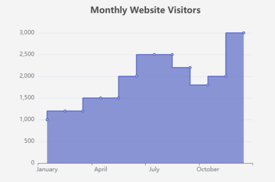
Let’s consider a hypothetical website that tracks its visitors over a year. The number of visitors fluctuates based on various factors, such as marketing campaigns or seasonal trends. Here’s how the data might look:
| Month | Visitors |
|---|---|
| January | 1000 |
| February | 1200 |
| March | 1200 |
| April | 1500 |
| May | 1500 |
| June | 2000 |
| July | 2500 |
| August | 2500 |
| September | 2200 |
| October | 1800 |
| November | 2000 |
| December | 3000 |
Visual Paradigm Online Charting Tool for creating Step Chart
- Title: Provides context for the chart.
- Tooltip: Displays data on hover.
- Axes: Define the data for the x-axis (months) and y-axis (number of visitors).
- Series: Configures the data series with
step: 'start'to create the step effect.
Interpretation of the Monthly Website Visitors Data
Overview of the Data
The data represents the number of visitors to a hypothetical website over a 12-month period. The figures show fluctuations in visitor numbers, influenced by various factors such as marketing efforts, seasonal trends, or changes in content.
Key Observations
- Initial Growth:
- January to February: The visitor count increased from 1,000 to 1,200, indicating a positive response, possibly due to an effective marketing strategy or promotional activities.
- Stability:
- February to March: The number of visitors remained steady at 1,200. This suggests that while there was an initial growth, the website may have reached a plateau during this period, indicating potential challenges in maintaining visitor interest.
- Significant Increases:
- March to April: A jump to 1,500 visitors shows a resurgence, possibly due to new content or marketing campaigns.
- June to July: A notable rise from 2,000 to 2,500 visitors could indicate the success of a summer campaign or seasonal interest.
- Peak Visitors:
- December: The visitor count peaks at 3,000. This could be attributed to holiday promotions, end-of-year sales, or increased online activity during this season.
- Declines:
- August to September: The visitor numbers drop from 2,500 to 2,200. This decline may reflect a post-summer slump, as many users may return to regular routines after vacations.
- October: Another decrease to 1,800 visitors suggests a continued downward trend, possibly due to seasonal factors or decreased promotional activities.
- Recovery:
- October to November: An increase back to 2,000 visitors indicates either a seasonal recovery or new marketing efforts coming into play.
What This Data Shows
- Trend Analysis: The step chart visually highlights the periods of growth, stability, and decline, making it easy to identify patterns over the year.
- Effectiveness of Strategies: The spikes in visitor numbers suggest that targeted marketing campaigns or seasonal content can significantly impact website traffic.
- Seasonality: The data reflects a potential seasonal trend, with peaks during holidays and dips during off-peak months.
- Need for Adaptation: The fluctuations indicate the necessity for continuous adaptation in marketing strategies to maintain and grow visitor numbers, especially during downturns.
Conclusion
Step charts are a powerful tool for visualizing data with discrete changes over time. They provide clarity in understanding trends and variations, making them ideal for scenarios like tracking visitors, sales, or any similar metrics. Using Visual Paradigm Online Chart tool, you can create interactive and visually appealing charts that enhance data comprehension.
The interpretation of the monthly website visitors data reveals important insights into user behavior and the effectiveness of marketing strategies. By analyzing these trends, the website owners can make informed decisions to enhance user engagement, optimize promotional campaigns, and ultimately drive growth.
Step Charts Templates
Visual Paradigm Online offers a vast collection of templates designed for various types of charts, visuals, and infographics. This feature makes it incredibly easy for users to create professional and visually appealing content without starting from scratch. Here’s a closer look at what you can expect:
Key Features of Visual Paradigm Online Templates
- Wide Variety of Chart Types:
- From bar charts and line graphs to pie charts and area charts, Visual Paradigm Online provides templates for all your data visualization needs.
- Infographic Templates:
- Create engaging infographics quickly with ready-to-use templates that make complex information easy to understand.
- Customizable Designs:
- Each template is highly customizable, allowing you to adjust colors, fonts, and layouts to align with your brand identity.
- User-Friendly Interface:
- The intuitive drag-and-drop interface simplifies the design process, making it accessible for users of all skill levels.
- Collaboration Features:
- Work with team members in real-time, making it easy to gather feedback and make adjustments collaboratively.
- Cloud-Based Access:
- Access your designs from anywhere, anytime, without the need for software installation.
Why Use Visual Paradigm Online?
- Save Time: Quickly find and modify templates that suit your project needs, reducing the time spent on design.
- Professional Quality: Produce high-quality visuals that enhance your presentations, reports, and marketing materials.
- Versatility: Ideal for marketers, educators, business analysts, and anyone looking to create compelling visuals.
Get Started Today!
Unlock the potential of your data and ideas with Visual Paradigm Online’s extensive library of templates. Whether you’re crafting charts, infographics, or other visuals, you’ll find everything you need to make your content stand out.
👉 [Explore Visual Paradigm Online Now!]

