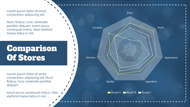
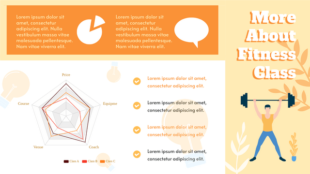
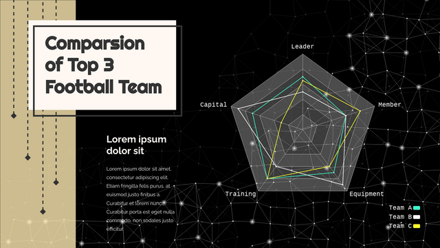
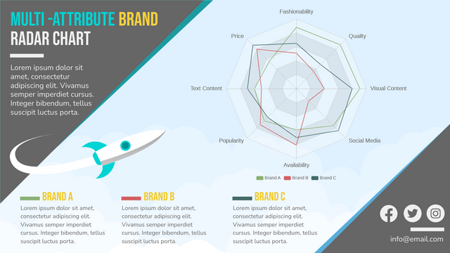
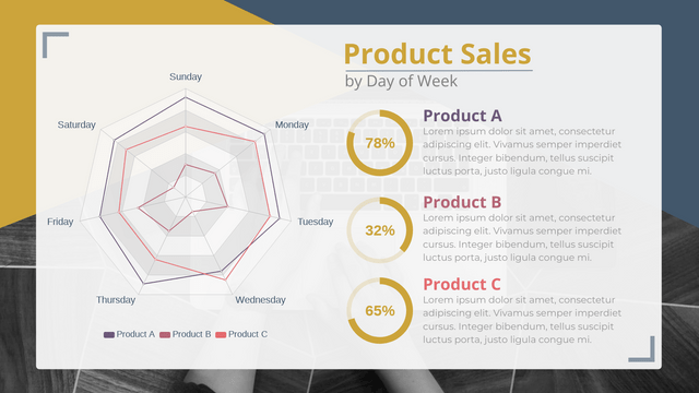
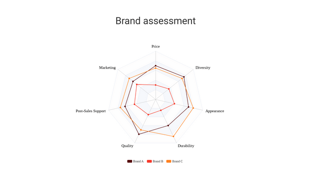
A radar chart (also known as a spider chart or web chart) is a graphical representation of multivariate data. It displays data in a way that allows for the comparison of multiple variables. Each axis represents a different variable, and the values for each variable are plotted along the axes, forming a polygon.

When to Use a Radar Chart
- Comparative Analysis: To compare multiple items across several variables.
- Performance Evaluation: To assess the performance of different entities (like products, teams, or individuals) based on various criteria.
- Skill Assessment: To visualize skill levels in different areas for individuals or groups.
Examples
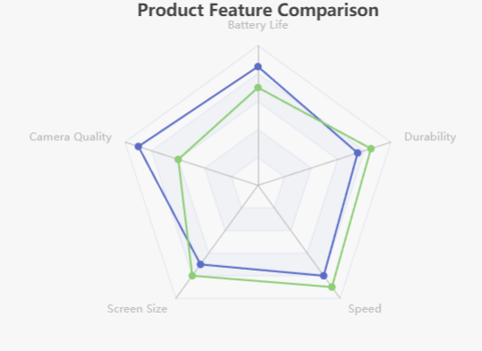
- Product Comparison: Compare features of different smartphones (battery life, camera quality, screen size, etc.).
- Team Performance: Evaluate team members on skills like communication, leadership, technical skills, and collaboration.
- Survey Results: Visualize responses to survey questions on various attributes like satisfaction, importance, and likelihood.
Visualization with Visual Paradigm
More Radar Chart Examples
Example 1: Student Skill Assessment
Dataset
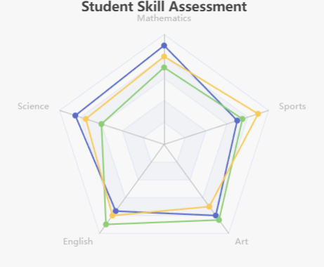
This radar chart evaluates three students across five skills: Mathematics, Science, English, Art, and Sports.
| Skill | Alice | Bob | Charlie |
|---|---|---|---|
| Mathematics | 90 | 70 | 80 |
| Science | 85 | 60 | 75 |
| English | 75 | 90 | 80 |
| Art | 80 | 85 | 70 |
| Sports | 70 | 75 | 90 |
Example 2: Product Feature Comparison
Dataset
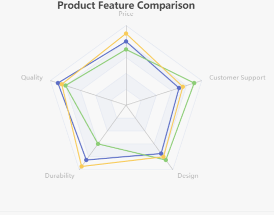
This radar chart compares three products based on five features: Price, Quality, Durability, Design, and Customer Support.
| Feature | Product A | Product B | Product C |
|---|---|---|---|
| Price | 80 | 70 | 90 |
| Quality | 90 | 80 | 85 |
| Durability | 85 | 60 | 95 |
| Design | 75 | 85 | 80 |
| Customer Support | 70 | 90 | 75 |
Example 3: Fitness Level Assessment
Dataset
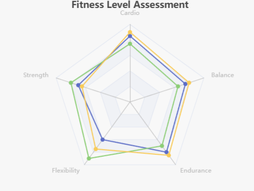
This radar chart assesses the fitness levels of three individuals across five activities: Cardio, Strength, Flexibility, Endurance, and Balance.
| Activity | John | Sarah | Mike |
|---|---|---|---|
| Cardio | 85 | 75 | 90 |
| Strength | 70 | 80 | 65 |
| Flexibility | 60 | 90 | 75 |
| Endurance | 80 | 70 | 85 |
| Balance | 75 | 65 | 80 |
Radar Charts Templates
If you’re looking to enhance your skills in data visualization and chart creation, I recommend visiting the Visual Paradigm Chart Templates. Here, you can find a wide variety of templates for different types of charts, including radar charts, that can serve as inspiration for your own projects.
Why Visit Visual Paradigm Chart Templates?
- Diverse Options: Explore a range of chart types to suit various data visualization needs, from simple to complex datasets.
- Customization: Learn how to customize templates to better fit your specific requirements, enhancing your design skills.
- Best Practices: Gain insights into best practices for data visualization, ensuring your charts are both informative and aesthetically pleasing.
- Practical Examples: Use real-world examples as a basis for your projects, making it easier to understand how to apply different chart types effectively.
How to Get Started
- Visit the Website: Check out the Visual Paradigm Chart Templates here.
- Explore Templates: Browse through the various chart templates available to find those that resonate with your data needs.
- Experiment: Download templates and practice customizing them to get hands-on experience in data visualization.
By leveraging these resources, you can deepen your understanding of chart design and improve your ability to communicate data effectively!
