Doughnut charts are a variation of pie charts that display data in a circular format, with a hole in the center. They are often used to show the proportions of various components of a whole, making them useful for visualizing relative sizes.
Key Concepts
- Structure: A doughnut chart is composed of arcs that represent different categories of data. Each arc’s angle is proportional to the value it represents.
- Data Representation: The total value of all categories should sum to a meaningful total (e.g., 100% for percentages). The hole in the center can also be used to display additional information, such as the total value or a label.
- Colors and Legends: Different segments are typically colored differently to allow easy differentiation. A legend can help clarify what each color represents.
- Interactivity: Modern implementations can include tooltips that provide more information when users hover over segments.
Realistic Example
Scenario: Market Share of Smartphone Brands
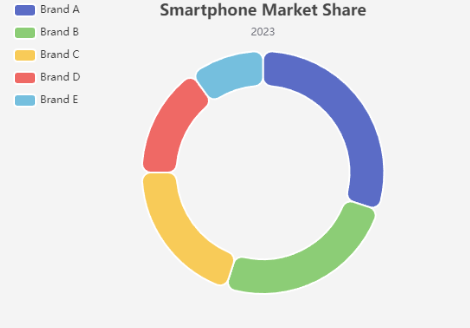
Let’s say we have market share data for five smartphone brands:
- Brand A: 30%
- Brand B: 25%
- Brand C: 20%
- Brand D: 15%
- Brand E: 10%
Data Representation
This data can be visually represented using a doughnut chart, which will help viewers quickly grasp the market distribution among these brands.
