Introduction
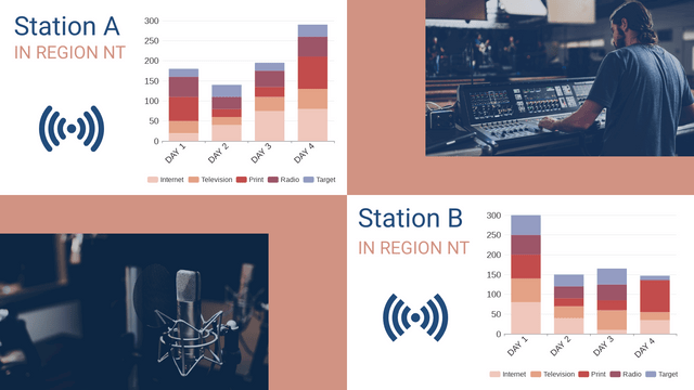
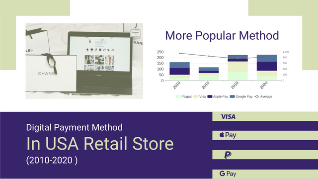
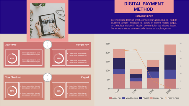
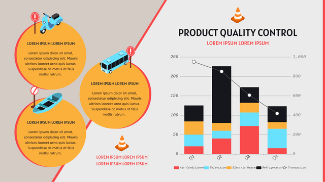
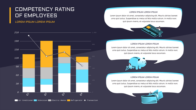
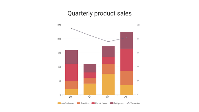
Stacked column and line charts are powerful tools for visualizing data, allowing you to display multiple data series in a single chart. This tutorial will guide you through creating these charts, understanding their components, and their use cases.

What Are Stacked Column and Line Charts?
- Stacked Column Chart: Displays multiple data series stacked on top of each other in vertical columns. This format helps visualize the total and the contribution of each series to that total.
- Line Chart: Shows data points connected by lines, making it useful for displaying trends over time.
Combining both types can help you compare different data series while observing overall trends.
When to Use Them
- Stacked Column Charts: Ideal for showing the composition of data across categories (e.g., sales by product category over several months).
- Line Charts: Best for showing trends over time (e.g., monthly sales growth).
Creating a Stacked Column and Line Chart
Step 1: Gather Your Data
Here’s an example dataset:
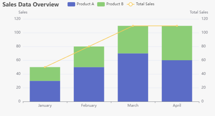
| Month | Product A | Product B | Total Sales |
|---|---|---|---|
| January | 30 | 20 | 50 |
| February | 50 | 30 | 80 |
| March | 70 | 40 | 110 |
| April | 60 | 50 | 110 |
Step 2: Choose a Charting Tool
You can use various tools to create these charts, such as:
- Excel
- Google Sheets
- Tableau
- Python with Matplotlib or Seaborn
Step 3: Create the Stacked Column Chart
In Excel or Google Sheets:
- Input Data: Enter your data in a spreadsheet.
- Select Data: Highlight the data range excluding the “Total Sales”.
- Insert Chart:
- Go to the Insert tab.
- Choose Column Chart and select Stacked Column.
- Format Chart:
- Add titles, labels, and legends as needed.
- Adjust colors for better distinction between series.
Step 4: Add a Line Chart
- Select Data: Highlight the “Total Sales” data along with the stacked columns.
- Insert Combo Chart:
- Go to the Insert tab.
- Choose Combo Chart and select Line for Total Sales and Stacked Column for Products.
- Format Axes:
- Ensure the primary axis is for stacked columns and the secondary axis is for the line chart.
Step 5: Customize Your Chart
- Titles and Labels: Add a clear title and axis labels.
- Color Coding: Use contrasting colors for different data series.
- Legend: Ensure the legend is clear for easy interpretation.
Example Visualization with Visual Paradigm
Discover Visual Paradigm Online: The Ultimate Solution for Charts, Diagrams, and Creative Visuals
In today’s fast-paced digital world, effective communication is essential. Whether you’re drafting a business report, mapping out a project, or presenting data insights, the right visuals can make all the difference. That’s where Visual Paradigm Online comes into play—a comprehensive solution for creating stunning charts, diagrams, and creative visuals.
Why Choose Visual Paradigm Online?
1. User-Friendly Interface
Visual Paradigm Online boasts an intuitive interface that makes it easy for anyone, regardless of skill level, to create professional-quality visuals. With drag-and-drop functionality, you can quickly design your charts and diagrams without any steep learning curve.
2. Versatile Charting Options
From bar charts to pie charts, and from line graphs to area charts, Visual Paradigm Online offers a wide variety of chart types. This versatility allows you to select the best format to represent your data clearly and effectively.
3. Powerful Diagramming Tools
In addition to charts, Visual Paradigm Online provides robust diagramming capabilities. Create flowcharts, mind maps, organizational charts, and UML diagrams with ease. These tools are perfect for visualizing processes, structures, and relationships.
4. Customizable Templates
Get started quickly with a vast library of customizable templates. Whether you need a business model canvas, a SWOT analysis, or a project timeline, you can find templates that suit your needs and easily modify them to fit your brand.
5. Collaboration Made Easy
Visual Paradigm Online supports real-time collaboration, allowing teams to work together seamlessly. Share your visuals with colleagues, gather feedback, and make adjustments in real time, ensuring everyone is on the same page.
6. Cloud-Based Convenience
Being cloud-based means you can access your projects from anywhere, at any time. Whether you’re in the office or on the go, your work is always available, and you don’t have to worry about losing your progress.
7. Integration Capabilities
Visual Paradigm Online integrates with various tools and platforms, enhancing your workflow. Connect with your favorite productivity apps and streamline your process from creation to presentation.
8. Export and Share Options
Once your visuals are complete, you can easily export them in multiple formats (PNG, JPG, PDF, etc.) for sharing or embedding in reports and presentations. This flexibility ensures your visuals can be used in any context.
Conclusion
Visual Paradigm Online stands out as the ultimate solution for anyone looking to create impactful charts, diagrams, and creative visuals. Its user-friendly design, versatile tools, and collaborative features make it a top choice for professionals across various fields.
Whether you’re a student, a business professional, or a project manager, Visual Paradigm Online can help you communicate your ideas effectively. Don’t miss out on the opportunity to elevate your visual communication—try Visual Paradigm Online today and experience the difference!
