Overview
Introduction
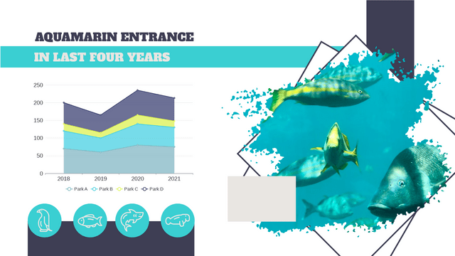
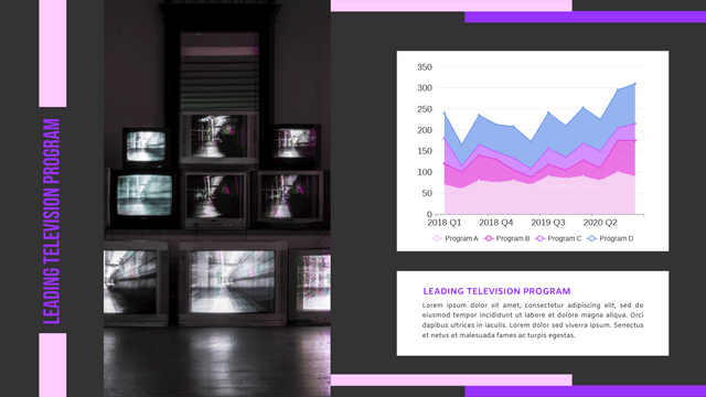
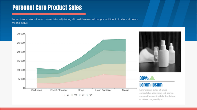
Stacked area charts are a powerful data visualization tool that effectively represent how different categories contribute to a whole over time. These charts are particularly useful in fields such as business and finance, where tracking multiple metrics—like revenue, expenses, and profits—is crucial for decision-making.

What is a Stacked Area Chart?
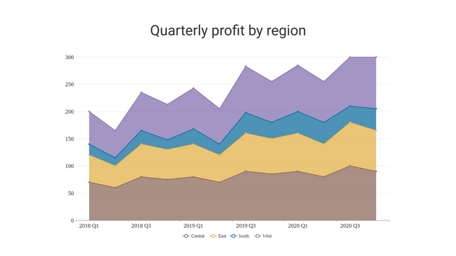
A stacked area chart is an extension of a regular area chart. It stacks multiple data series on top of one another, allowing viewers to see not only the overall trend but also the relative proportions of each category at any given time. This visual representation helps in understanding the cumulative contributions of various categories, making it easier to analyze changes over time.
Benefits of Stacked Area Charts
1. Visualizing Proportions
One of the primary advantages of stacked area charts is their ability to highlight changes in proportions between categories. For instance, if one category’s contribution diminishes while another’s increases, this change will be immediately apparent in the chart. This feature enables quick insights into category dynamics.
2. Illustrating Cumulative Changes
Stacked area charts are effective in portraying cumulative changes over time. Each data series builds on the previous one, providing a clear view of how the total is composed of its parts. This cumulative perspective can be particularly insightful for understanding trends in growth or decline across multiple categories.
3. Comparative Analysis
These charts facilitate comparison across different categories at specific time intervals. By analyzing the area covered by each category, stakeholders can assess which areas are performing well and which may need improvement.
Limitations of Stacked Area Charts
While stacked area charts offer several advantages, they also come with certain limitations:
- Complexity with Many Categories: When there are too many categories, the chart can become cluttered, making it difficult to read and interpret.
- Difficulty in Assessing Small Differences: If the values of different categories are close together, it may be challenging to discern meaningful differences, leading to potential misinterpretations.
Creating Stacked Area Charts with VP Online Chart Maker
Creating customized stacked area charts has never been easier, thanks to tools like VP Online Chart Maker. Here are some key features of this tool:
- Variety of Templates: Choose from a range of pre-designed templates that cater to different needs and styles.
- Customization Options: Modify colors, fonts, and data labels to ensure that your chart aligns with your branding or presentation requirements.
- Legends and Annotations: Adding a legend can significantly enhance the viewer’s understanding of what each category represents, making your chart more informative.
- Export Options: Once your chart is ready, you can export it in multiple formats such as JPG, PNG, and PDF, making it easy to incorporate into reports, presentations, and other materials.
Example of a Stacked Area Chart: Monthly Revenue Breakdown
Scenario
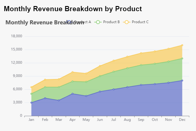
Imagine a company that tracks its monthly revenue from three different product lines: Product A, Product B, and Product C. Over the course of a year, the company wants to visualize how each product contributes to the total revenue.
Data
Here’s a simplified dataset representing the monthly revenue for each product:
| Month | Product A | Product B | Product C |
|---|---|---|---|
| January | 3000 | 2000 | 1500 |
| February | 4000 | 2500 | 1700 |
| March | 3500 | 3000 | 1800 |
| April | 5000 | 2800 | 2100 |
| May | 4500 | 3200 | 1900 |
| June | 5500 | 3500 | 2300 |
| July | 6000 | 4000 | 2500 |
| August | 6500 | 4300 | 2600 |
| September | 7000 | 4500 | 2700 |
| October | 7200 | 4600 | 2800 |
| November | 7500 | 4800 | 2900 |
| December | 8000 | 5000 | 3000 |
Visualizing with Visual Paradigm Online Chart
Explanation of the Chart
- X-Axis: Represents the months of the year.
- Y-Axis: Represents the total revenue.
- Series: Each product’s revenue is represented as a stacked area, allowing for easy comparison of their contributions over time.
Conclusion
Stacked area charts serve as an effective means of visualizing how categories contribute to a whole over time. By leveraging tools like VP Online Chart Maker, users can create insightful and visually appealing charts that aid in data analysis and decision-making. Despite their limitations, when used appropriately, stacked area charts can provide valuable insights into trends and proportions, making them an essential tool in data visualization.
Why Visual Paradigm Online is the Ultimate Choice for Chart Creation
1. Extensive Chart Variety
Visual Paradigm Online boasts over 50 chart types, ensuring you can find the ideal representation for your data. From classic bar and line charts to specialized formats like area, pie, doughnut, radar, and rose charts, our platform empowers you to select the most effective visualization tailored to your needs.
2. Beautifully Crafted Templates
Crafting visually stunning charts has never been easier. With a diverse range of professionally designed templates, Visual Paradigm Online enables you to create high-quality infographics, posters, presentations, and reports effortlessly. Simply replace the placeholder text and data, and you’ll have a polished product ready to share in no time.
3. Complete Customization
Recognizing that every project is unique, Visual Paradigm Online offers comprehensive customization options. Tailor every aspect of your charts—from colors and fonts to the arrangement of titles and legends. This flexibility ensures your charts not only convey information effectively but also resonate with your brand identity.
4. Fast and Efficient Creation
In today’s fast-paced world, time is of the essence. Our intuitive interface allows you to transform raw data into striking visuals in just minutes. With streamlined data entry and instant visualization, you can meet tight deadlines without sacrificing quality.
5. Risk-Free Trial
Getting started with Visual Paradigm Online is entirely hassle-free! Explore our full range of chart-making capabilities without the need for a credit card. Experience firsthand the benefits of our tool without any financial commitment.
When it comes to chart creation, Visual Paradigm Online is the premier solution. With a vast array of chart types, beautiful templates, and extensive customization options, you can produce professional-grade visuals that elevate your presentations and reports.
Start Your Journey Today!
Ready to enhance your data visualization? Discover all our templates and see why Visual Paradigm Online is the go-to choice for your chart-making needs. Whether you’re preparing for an important meeting, crafting an insightful report, or designing an eye-catching infographic, our tool is here to help you communicate your message effectively and beautifully.

