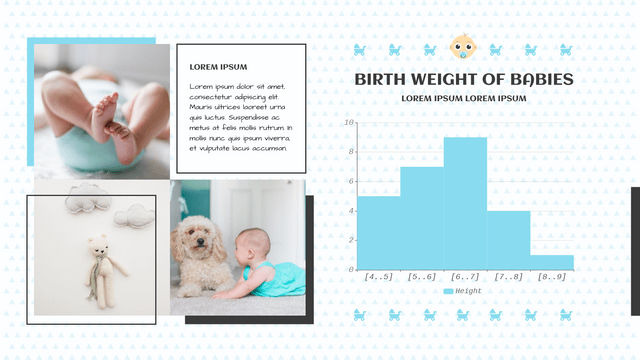
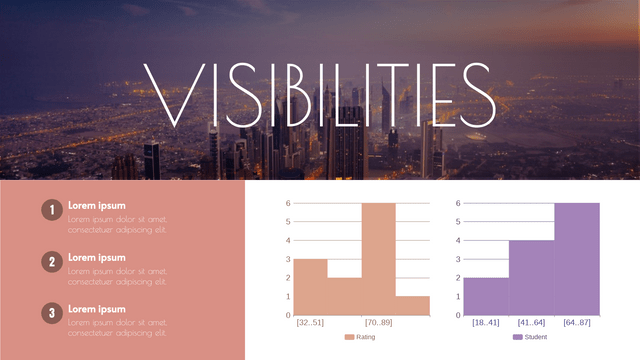
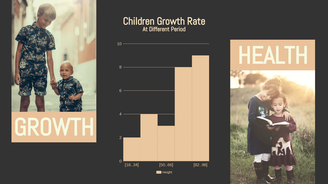
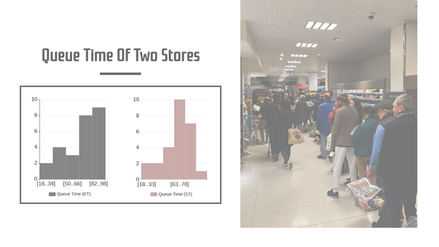
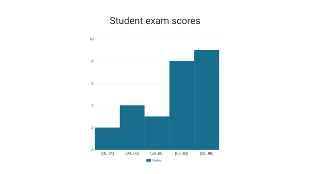
Histograms are a powerful tool in statistics used to visualize the distribution of numerical data. They provide insights into the underlying frequency distribution of a dataset, making them essential for data analysis in various fields, including business, science, and social studies.
What is a Histogram?
A histogram is a graphical representation of the distribution of numerical data. It is created by dividing the entire range of values into a series of intervals, known as “bins,” and counting how many values fall into each bin. The height of each bar in the histogram represents the frequency (or count) of data points within that interval.
Key Concepts
- Bins: Intervals into which the data is divided. The choice of bin size can significantly affect the appearance of the histogram.
- Frequency: The number of data points that fall within each bin.
- Distribution Shape: Histograms can reveal the shape of the data distribution (e.g., normal, skewed, bimodal).
Real-Life Example: Exam Scores
Consider a scenario where a teacher wants to analyze the exam scores of a class of 30 students. The scores (out of 100) are as follows:
Steps to Create a Histogram
- Determine the Range: The lowest score is 34, and the highest is 100.
- Choose Bin Width: Let’s use a bin width of 10. The bins will be:
- 30-39
- 40-49
- 50-59
- 60-69
- 70-79
- 80-89
- 90-99
- 100-109
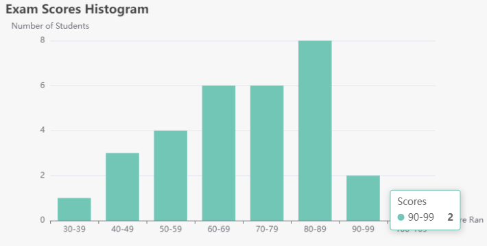
- Count Frequencies: Count how many scores fall into each bin.
Frequency Count
- 30-39: 1
- 40-49: 3
- 50-59: 4
- 60-69: 6
- 70-79: 6
- 80-89: 8
- 90-99: 2
- 100-109: 1
Creating the Chart with Visual Paradigm Online
Histogram vs. Bar Chart vs. Column Chart: Understanding the Differences
When visualizing data, it’s essential to choose the right type of chart to effectively communicate the information. Three commonly used chart types are histograms, bar charts, and column charts. While they may appear similar, they serve different purposes and are used in distinct contexts. Let’s explore their differences.
Histogram
Definition
A histogram is a graphical representation of the distribution of numerical data. It shows the frequency of data points within specified intervals (bins).
Characteristics
- Data Type: Used for continuous numerical data.
- Bins: Divides the data into intervals (bins) along the x-axis.
- Bars: Touch each other to indicate continuous data.
- Purpose: To display the distribution and frequency of data points.
When to Use
- When analyzing the distribution of a dataset, such as exam scores, heights, or weights.
Example Use Case
Visualizing the distribution of students’ exam scores to understand how many students fall into various score ranges.
Bar Chart
Definition
A bar chart displays categorical data with rectangular bars representing the frequency or value of each category.
Characteristics
- Data Type: Used for categorical data (discrete categories).
- Bars: Do not touch each other, representing separate categories.
- Orientation: Typically horizontal, but can also be vertical.
- Purpose: To compare quantities across different categories.
When to Use
- When comparing different groups, such as sales by product category or survey results by demographic group.
Example Use Case
Comparing the sales figures of different products in a store.
Column Chart
Definition
A column chart is similar to a bar chart but is oriented vertically. It also displays categorical data.
Characteristics
- Data Type: Used for categorical data (discrete categories).
- Bars: Vertical rectangles representing categories.
- Purpose: To compare quantities across different categories, similar to a bar chart.
When to Use
- When presenting data in a vertical format for easy comparison, especially when dealing with time series data.
Example Use Case
Visualizing monthly sales data for a company over a year.
Summary of Differences
| Feature | Histogram | Bar Chart | Column Chart |
|---|---|---|---|
| Data Type | Continuous numerical data | Categorical data | Categorical data |
| Bars | Touch each other | Do not touch | Do not touch |
| Orientation | Vertical / Horizontal (data distribution) | Vertical / Horizontal (categories) | Vertical (categories) |
| Purpose | Show distribution and frequency | Compare categories | Compare categories |
Choosing between a histogram, bar chart, and column chart depends on the type of data you are working with and the message you want to convey. Understanding the distinctions among these charts will help you present your data more effectively and make informed decisions based on your analysis.
Conclusion
Histograms are an essential tool for understanding data distributions. By visualizing the frequency of scores in the example above, the teacher can quickly assess how students performed overall, identify trends in scores, and make informed decisions about future teaching strategies. Whether in education, business, or research, mastering histograms will enhance your data analysis skills and help convey complex information more effectively.
Histograms Templates
