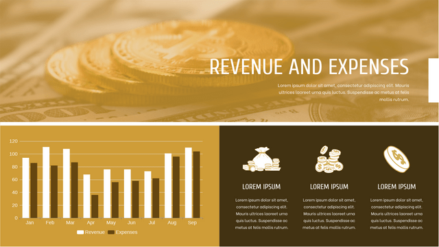
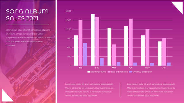
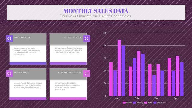
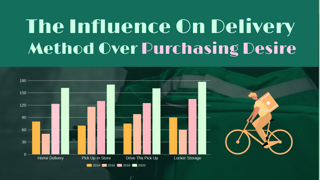
In this tutorial, we will explore how to create and customize grouped column charts using a fictional online chart-making tool, VP Online. Grouped column charts are excellent for comparing multiple variables across different categories, making them a favorite in business, marketing, and finance.
Key Features
- Flexible Data Management
- Add Media
- Drag and Drop Functionality
- Share Options
- Online Access
- Fully Customizable Templates
Step 1: Accessing the Chart Maker
- Online Access: Open your web browser and navigate to the VP Online Chart Maker.
- Create a New Chart: Click on the “Create New Chart” button.
Step 2: Choosing a Grouped Column Chart Template
- Template Library: Access the template library from the main dashboard.
- Select a Template: Browse through the available grouped column chart templates. Choose one that fits your needs (e.g., sales comparison, budget tracking).
- Load the Template: Click on the selected template to start customizing.
Step 3: Importing Your Data
- Flexible Data Management: Use the import feature to upload your data from a CSV file or manually enter it into the provided fields.
- Organizing Data: Ensure your data is organized into categories and series for accurate visualization.
Step 4: Customizing Your Chart
- Adjust Column Colors: Click on the columns to open the color picker. Choose colors that represent different data series effectively.
- Change Axis Labels and Titles: Edit the titles and labels by clicking on them. Ensure they are descriptive and informative.
- Add Media: To enhance your chart, you can add images or graphics. Use the “Add Media” option to upload visuals that complement your data.
- Drag and Drop: Rearrange your columns or series by simply dragging them to the desired position within the chart.
Step 5: Final Touches
- Design Elements: Explore additional design options such as borders, shadows, or patterns to make your chart visually appealing.
- Preview Your Chart: Use the preview option to see how your chart looks before finalizing.
Step 6: Sharing Your Chart
- Share Options: Once you are satisfied with your grouped column chart, click on the “Share” button.
- Choose a Sharing Method: Select whether you want to share via a link, embed the chart on a website, or download it as an image or PDF.
Example: Sales Comparison of Different Products Across Regions
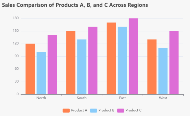
Let’s create a grouped column chart to compare the sales of three different products (A, B, and C) across four regions (North, South, East, and West). This example will help illustrate how grouped column charts can effectively display complex data.
Data Overview
| Region | Product A | Product B | Product C |
|---|---|---|---|
| North | 120 | 100 | 140 |
| South | 150 | 130 | 160 |
| East | 170 | 160 | 180 |
| West | 130 | 110 | 150 |
Key Concepts Illustrated
- Multiple Series: Each product represents a series of data, allowing for side-by-side comparison within each region.
- Categories: The regions serve as the main categories for comparison.
- Customization: The chart can be customized with colors, labels, and media to enhance understanding.
Conclusion
Creating a grouped column chart with VP Online is a straightforward process that allows you to manage your data flexibly and customize your charts to meet your specific needs. By leveraging the template library and the variety of customization options, you can produce professional-looking charts quickly and efficiently. Happy charting!
Grouped Column Charts Templates
