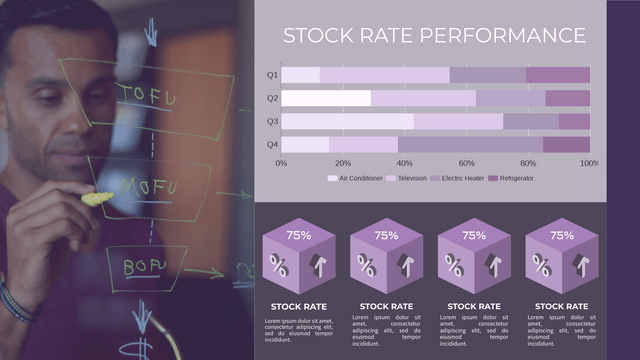
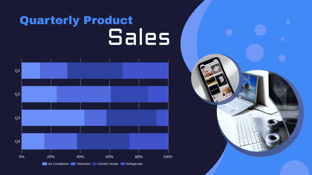
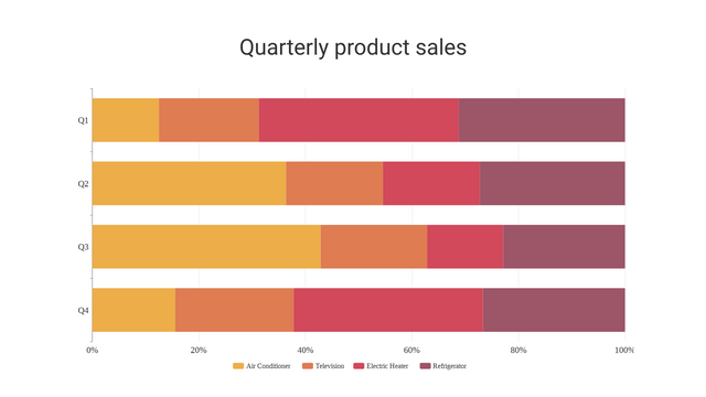
What is a 100% Stacked Bar Chart?
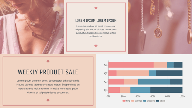
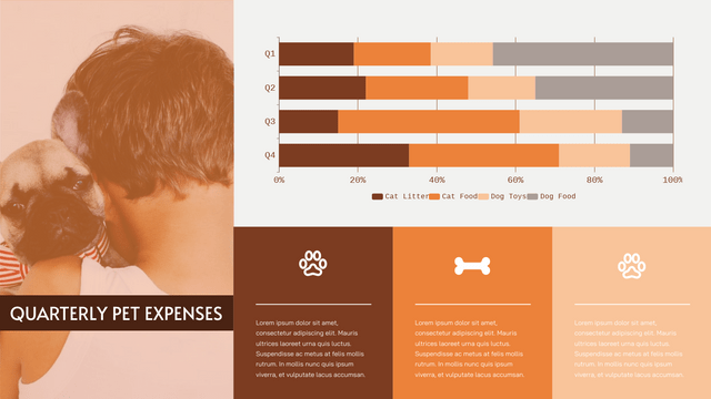
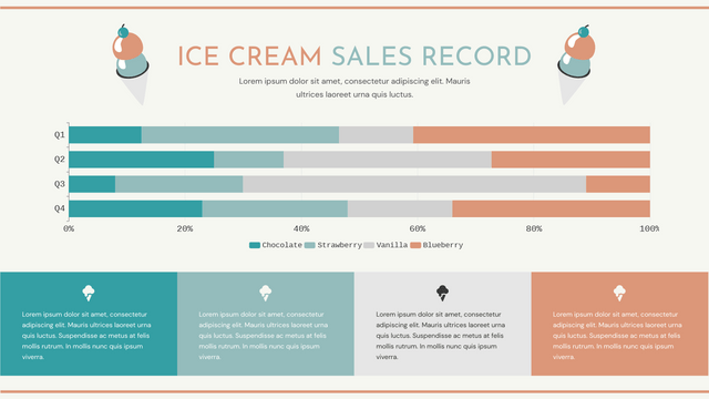
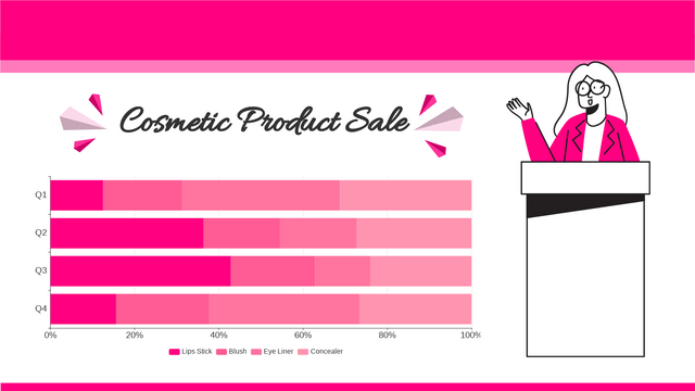
A 100% stacked bar chart is a variation of the traditional stacked bar chart in which each bar represents a total of 100%. This chart type is used to show the relative percentage of each category within a total across different groups. The lengths of the segments in each bar represent the proportion of each category relative to the whole, rather than their absolute values.
Key Features:
- Normalized Values: Each bar is scaled to a total of 100%, allowing for easy comparison of the distribution of categories across different groups.
- Visual Emphasis on Proportion: It highlights the composition of the data rather than the actual values, making it suitable for understanding the relative contribution of each part.
Differences Between 100% and Non-100% Stacked Bar Charts
1. Value Representation
- 100% Stacked Bar Chart: Represents each bar as a percentage of the total, making it easy to compare the relative sizes of categories across different groups.
- Non-100% Stacked Bar Chart: Represents the absolute values of each category, allowing for comparisons of total quantities.
2. Focus
- 100% Stacked Bar Chart: Focuses on the proportion of each category relative to the total for each group.
- Non-100% Stacked Bar Chart: Focuses on the actual quantities, which can reveal trends in total values.
3. Interpretation
- 100% Stacked Bar Chart: Useful for comparing the distribution of categories when the total is not as important as the composition.
- Non-100% Stacked Bar Chart: More effective when the actual values or totals are significant for the analysis.
Example: Comparing 100% and Non-100% Stacked Bar Charts
Scenario: Sales Distribution by Region
Imagine a company that sells three products (A, B, C) in two different regions (North and South). The sales figures for each product are as follows:
| Region | Product A | Product B | Product C |
|---|---|---|---|
| North | 120 | 80 | 100 |
| South | 150 | 100 | 50 |
Non-100% Stacked Bar Chart
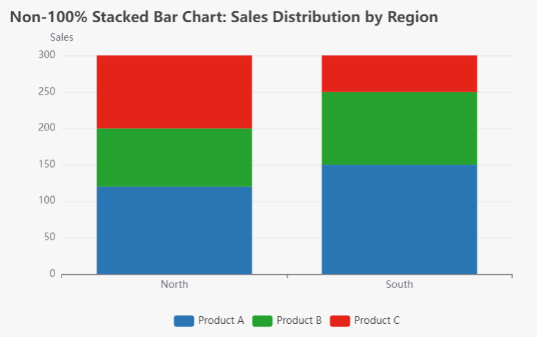
In a non-100% stacked bar chart, the actual sales figures are represented. Each bar’s height corresponds to the total sales for each region.
- North Region Total Sales: 120 + 80 + 100 = 300
- South Region Total Sales: 150 + 100 + 50 = 300
Visualization:
- The North region bar will have segments representing 120 (A), 80 (B), and 100 (C).
- The South region bar will have segments representing 150 (A), 100 (B), and 50 (C).
100% Stacked Bar Chart
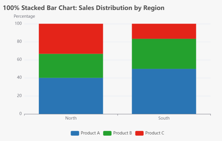
In a 100% stacked bar chart, the sales figures will be converted into percentages of the total sales for each region.
- North Region:
- Product A: (120 / 300) * 100 = 40%
- Product B: (80 / 300) * 100 = 26.67%
- Product C: (100 / 300) * 100 = 33.33%
- South Region:
- Product A: (150 / 300) * 100 = 50%
- Product B: (100 / 300) * 100 = 33.33%
- Product C: (50 / 300) * 100 = 16.67%
Visualization:
- Each bar will reach the same height (100%), with segments representing the percentage contribution of each product.
Why Choose Visual Paradigm Online?
1. Quick and Easy Data Visualization
Visual Paradigm Online allows you to visualize your data and statistics quickly and effortlessly. With its intuitive interface, you can create charts in just a few clicks, transforming raw data into compelling visuals that tell a story.
2. Extensive Template Library
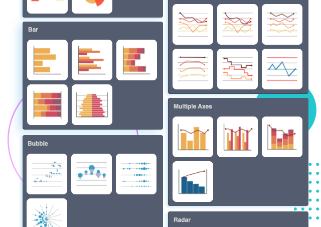
The platform offers an impressive selection of 50+ chart types, ensuring you find the perfect representation for your data. From common charts like bar and line charts to advanced options such as radar and rose charts, Visual Paradigm has you covered. You can browse through a diverse range of templates tailored to various needs, making it easier than ever to create professional-looking charts.
3. Beautiful Chart Templates
Visual Paradigm Online provides a wide array of beautiful chart templates designed to enhance your presentations, reports, infographics, and posters. Simply replace the placeholder text and chart data with your own, and you’ll have a polished creation ready for publication. This feature is especially beneficial for those who may lack design skills but still want to produce visually appealing content.
4. Fully Customizable Options
Customization is key to effective data visualization. With Visual Paradigm, you can customize every aspect of your charts to align with your brand or presentation theme. Adjust colors, fonts, and the positioning of titles and legends with just a few clicks. This level of flexibility ensures that your charts not only convey information but also resonate with your audience.
5. No Credit Card Required
One of the standout features of Visual Paradigm Online is that you can start using the tool without needing to provide a credit card. This makes it accessible for everyone, allowing you to explore its capabilities risk-free.
6. Create Charts in Minutes
The platform is designed for efficiency, enabling you to create impressive charts in minutes. Whether you need a quick visual for a meeting or a detailed infographic for a report, Visual Paradigm Online streamlines the process so you can focus on what matters most—your data.
Conclusion
Both 100% stacked bar charts and non-100% stacked bar charts serve important roles in data visualization, depending on the context and the message you wish to convey.
- Use 100% stacked bar charts when you want to emphasize the proportion of categories within a total, allowing for easier comparison of distributions.
- Opt for non-100% stacked bar charts when the actual values matter, providing insights into the total quantities involved.
In summary, stacked bar charts, both non-100% and 100%, serve distinct purposes in data visualization. The non-100% stacked bar chart effectively displays absolute values, allowing for direct comparisons of total sales across different categories and regions. This type of chart is ideal for scenarios where the actual quantities matter, providing insights into the performance of each product.
On the other hand, the 100% stacked bar chart normalizes the data, representing each category as a percentage of the total. This allows viewers to easily compare the relative proportions of different categories across groups, making it particularly useful for understanding the composition of data without being influenced by the actual quantities.
Choosing the right type of stacked bar chart depends on the context and the insights you wish to convey. By understanding the differences between these two types, you can effectively communicate data trends and relationships, enhancing your overall data storytelling. Whether you prioritize absolute values or relative proportions, both chart types can significantly enhance your data analysis and presentation skills.
