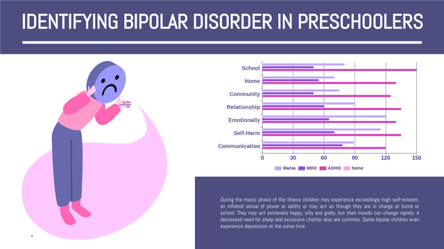
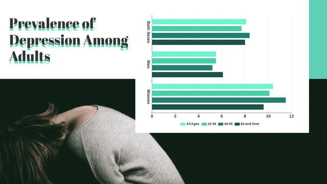
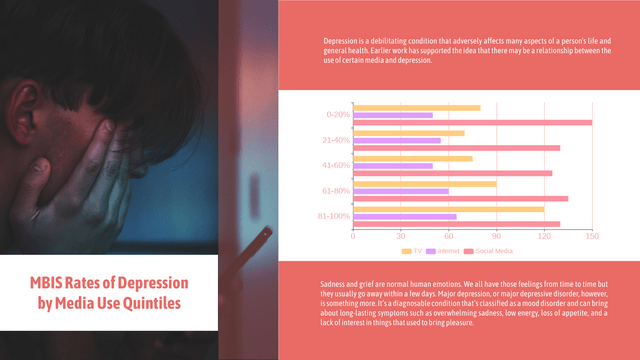
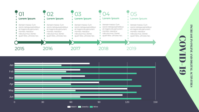
Grouped bar charts are a powerful visualization tool used to display and compare the values of multiple categories across different groups. They allow for easy comparison of data points, making them particularly useful in various fields such as business, education, and research.
Key Concepts
1. Definition
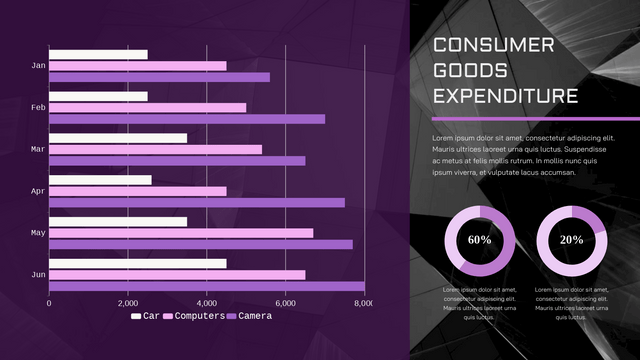
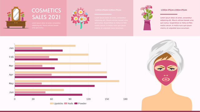
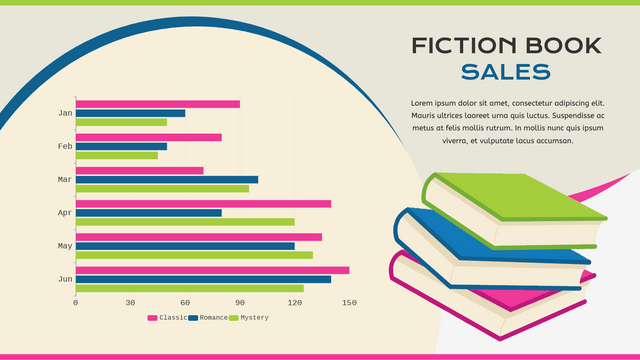
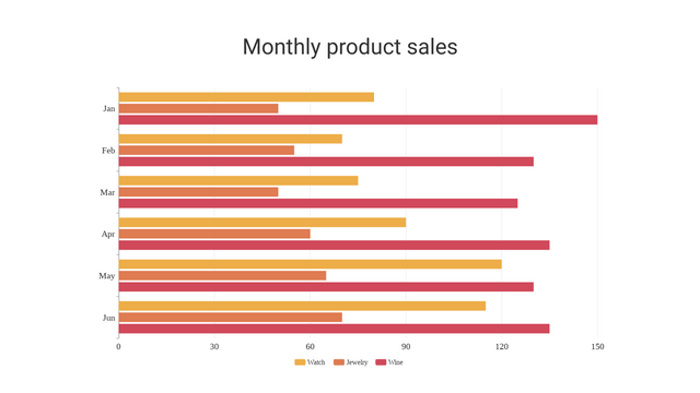
A grouped bar chart (or clustered bar chart) consists of bars grouped together based on categories, allowing viewers to compare different sub-categories within each main category. Each group typically represents a different category, and each bar within the group represents a sub-category.
2. Structure
- Axes: The horizontal axis (x-axis) typically represents the categories, while the vertical axis (y-axis) represents the values or frequencies.
- Bars: Each group of bars corresponds to a specific category, and each bar within that group represents a sub-category.
- Legend: A legend is often included to differentiate between the sub-categories represented by different colors.
3. Data Representation
Grouped bar charts are particularly useful for:
- Comparing multiple datasets across the same categories.
- Visualizing trends over time when the groups represent different time periods.
- Displaying relationships between categorical variables.
4. Design Considerations
To effectively design a grouped bar chart:
- Color: Use distinct colors for each sub-category to enhance differentiation.
- Spacing: Ensure appropriate spacing between bars to avoid clutter.
- Labels: Include clear labels for axes and bars to enhance readability.
- Scale: Choose an appropriate scale for the y-axis to accurately represent the data.
When to Use Grouped Bar Charts
Grouped bar charts are ideal for scenarios such as:
- Comparing sales figures across different products and time periods.
- Analyzing survey results across different demographic groups.
- Evaluating performance metrics across multiple departments within an organization.
Examples
Example 1: Sales Comparison
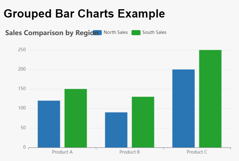
Imagine a company that sells three products (A, B, C) in two regions (North and South). A grouped bar chart can visually compare sales figures for each product across both regions.
| Product | North Sales | South Sales |
|---|---|---|
| A | 120 | 150 |
| B | 90 | 130 |
| C | 200 | 250 |
In the grouped bar chart, each group represents a product, with two bars per group representing sales in the North and South regions.
Example 2: Academic Performance
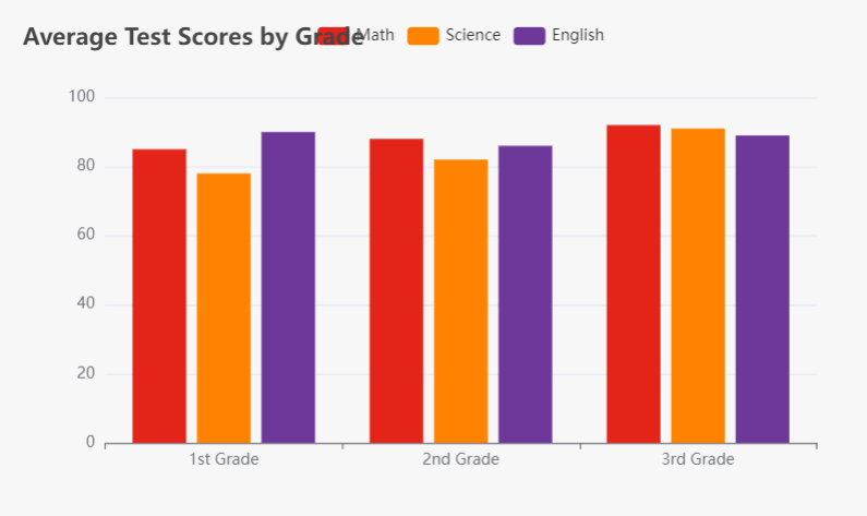
A school might want to compare the average test scores of students in different subjects (Math, Science, English) across different grades (1st, 2nd, and 3rd).
| Grade | Math | Science | English |
|---|---|---|---|
| 1st | 85 | 78 | 90 |
| 2nd | 88 | 82 | 86 |
| 3rd | 92 | 91 | 89 |
Here, each grade level forms a group, and the bars represent the average scores in each subject.
Advantages of Grouped Bar Charts
- Clarity: They provide a clear comparison of multiple datasets at once.
- Versatility: Applicable in numerous fields and for various types of data.
- Easy Interpretation: Well-designed charts are easy to read and interpret.
Limitations
- Complexity: Too many groups or sub-categories can make the chart cluttered and hard to read.
- Data Overlap: If values are similar, it may be difficult to distinguish between bars.
- Space Constraints: They may not work well with limited space or when there are many categories.
📊 Transform Your Data with Visual Paradigm’s Online Chart Maker! 🚀
Are you looking to visualize your data and statistics quickly and easily? Look no further! With Visual Paradigm’s Online Chart Maker, you can create stunning charts that make your data shine.
🌟 Why Choose Visual Paradigm?
- 50+ Chart Types: Whether you need a bar chart, line chart, pie chart, or more advanced options like radar and rose charts, we’ve got you covered! Choose from over 50 chart types to find the perfect fit for your data.
- Beautiful Templates: Our platform offers a wide range of professionally designed chart templates. Create infographics, posters, presentations, and reports in no time. Just replace the text and data, and you’re ready to publish and share!
- Fully Customizable: Personalize your charts to reflect your brand. Customize colors, fonts, titles, and legends effortlessly with just a few clicks. Tailor your charts to match your company’s style or the theme of your presentation.
- No Credit Card Required: Get started without any commitments! Explore our features and templates with zero hassle.
⏱️ Create Charts in Minutes!
Conclusion
Grouped bar charts are an effective way to visualize and compare data across multiple categories. By following design best practices and understanding when to use this type of chart, you can enhance the clarity and impact of your data presentations. Whether you’re analyzing sales, academic performance, or survey results, grouped bar charts can provide valuable insights and facilitate decision-making.
Transform your data into impressive charts that capture attention and convey your message effectively. It’s never been easier to create professional charts online!
👉 Browse all templates today and start visualizing your data with Visual Paradigm Online!
Your insights deserve to be seen. Create beautiful charts that tell your story!
