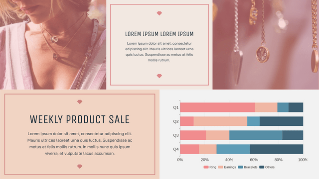
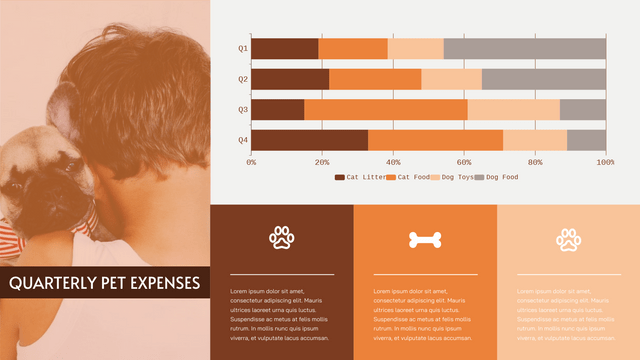
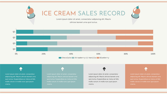
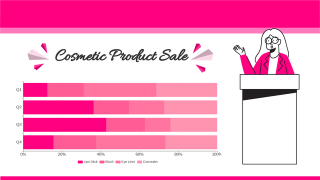
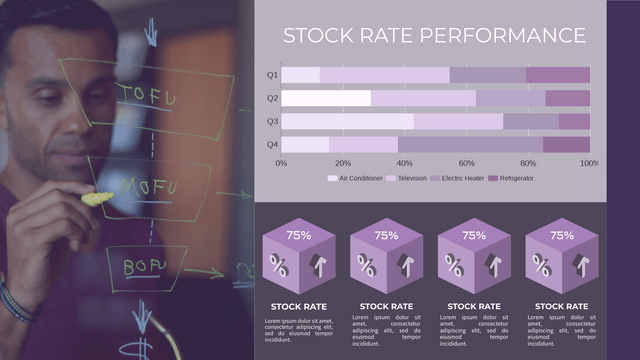
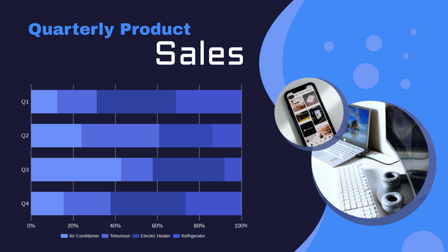
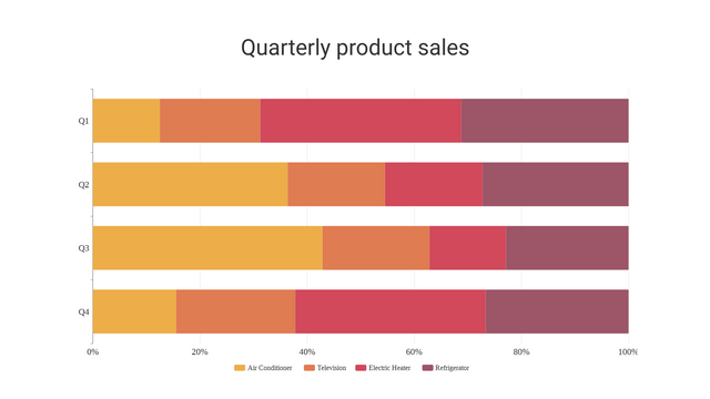
In the ever-evolving world of data visualization, stacked bar charts have emerged as a powerful tool for effectively communicating complex information. Unlike their standard bar chart counterparts, stacked bar charts offer a unique way to represent multiple data series within a single chart, providing deeper insights and facilitating more comprehensive comparisons.
What is a Stacked Bar Chart?
A stacked bar chart is a type of bar chart where individual data series are “stacked” on top of each other, forming a single bar for each category. The height of each stacked segment represents the value of that particular data series for the given category. This arrangement allows for the visualization of both the individual data series as well as the cumulative totals for each category.
Key Features of Stacked Bar Charts:
- Multiple Data Series: Stacked bar charts can accommodate the display of several data series within a single chart, making them ideal for comparing the contribution of different components to an overall total.
- Cumulative Totals: The height of the entire stacked bar represents the cumulative value of all the data series for that category, providing a quick overview of the overall performance or distribution.
- Relative Proportions: The size of each stacked segment within a bar visually represents the relative contribution or proportion of each data series to the overall total.
Use Cases for Stacked Bar Charts:
Stacked bar charts are particularly useful in the following scenarios:
- Comparing the performance or composition of different categories (e.g., sales by product line, energy consumption by sector)
- Visualizing the distribution of a whole across its parts (e.g., budget allocation, market share by region)
- Tracking changes in the relative proportions of different data series over time (e.g., revenue breakdown by product, website traffic sources)
Example: Stacked Bar Chart of Energy Consumption by Sector
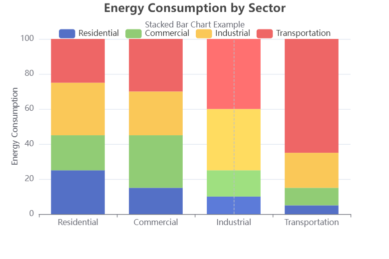
Consider a scenario where we want to visualize the energy consumption across different sectors, such as residential, commercial, industrial, and transportation. A stacked bar chart would be an excellent choice to represent this data:
Explanation and Interpretation of the Stacked Bar Chart Example
The stacked bar chart created using ECharts visualizes energy consumption across different sectors: Residential, Commercial, Industrial, and Transportation. Here’s how to interpret the chart:
Key Components of the Chart
- Title and Subtitle:
- The title “Energy Consumption by Sector” provides context for what the chart represents.
- The subtitle indicates that this is a stacked bar chart example, helping viewers understand the visualization type.
- Axes:
- X-Axis (Categories): Represents the different sectors of energy consumption (Residential, Commercial, Industrial, Transportation).
- Y-Axis (Values): Represents the amount of energy consumed, measured in appropriate units (e.g., megawatt-hours).
- Legend:
- The legend at the top identifies the different sectors represented by different colors in the stacked bars. This helps viewers quickly associate colors with specific categories.
- Bars:
- Each bar represents a sector’s energy consumption across four different categories. The height of each segment within a bar indicates the amount of energy consumed by that sector.
Interpreting the Data
- Total Energy Consumption:
- The overall height of each bar indicates the total energy consumption for that sector across all categories. For example, if the Residential bar has a total height of 100 units, it means that the combined energy consumption from all segments (Residential, Commercial, Industrial, Transportation) for this category is 100.
- Comparison of Sectors:
- By looking at the height of each bar, you can easily compare the total energy consumption across sectors. For example, if the Industrial bar is taller than the Residential bar, it indicates that Industrial energy consumption is greater.
- Proportional Contributions:
- The segments within each bar show how much each sector contributes to the total energy consumption. For instance, if the Residential segment is larger than the Commercial segment in the Residential bar, it indicates that Residential energy consumption is more significant than Commercial within that category.
- Trends:
- Analyzing the relative sizes of the segments can help identify trends. For example, if Transportation consistently has the largest segment across all categories, it suggests that it is the largest consumer of energy among the sectors.
- Emphasis and Focus:
- The chart allows for emphasis on specific series. If you hover over or click on a segment (depending on the chart’s interactivity), you may see detailed information about that sector’s consumption, enhancing the understanding of how each contributes to the total.
Promote Your Data with Visual Paradigm’s Online Chart Maker!
🚀 Visualize Your Data Effortlessly!
Unlock the power of your data with Visual Paradigm’s Online Chart Maker! Whether you’re presenting statistics, crafting reports, or designing infographics, our intuitive tool makes it quick and easy to create stunning charts.
🌟 Why Choose Visual Paradigm?
- No Credit Card Required: Start creating charts without any upfront commitment!
- 50+ Chart Types: From bar and line charts to advanced options like radar and doughnut charts, choose from over 50 types to perfectly represent your data.
- Beautiful Chart Templates: Access a wide range of professionally designed templates. Simply replace the text and data, and you’ll have a polished creation ready to share!
- Fully Customizable: Tailor your charts to align with your brand. Customize colors, fonts, and more to ensure your charts reflect your unique style.
- Create Charts in Minutes: Transform your data into impressive visualizations in just a few clicks!
💼 Perfect for Everyone: Whether you’re a business professional, educator, or student, Visual Paradigm’s online chart maker is designed to meet your needs.
👉 Get Started Now! Browse all templates and start visualizing your data today – no credit card required!
Elevate your presentations and reports with beautiful, impactful charts. Try Visual Paradigm Online Chart Maker today!
Conclusion
Overall, this stacked bar chart provides a clear visual representation of energy consumption by sector, making it easy to compare and analyze data at a glance. By interpreting the chart, viewers can understand not only the total energy consumption for each sector but also the relative contributions of different sectors, aiding in decision-making and strategy development regarding energy usage and efficiency.
Learn More Stacked Bar Chart Examples
