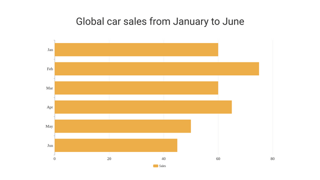
Bar charts are a popular way to represent categorical data visually. They provide a clear and concise way to compare different groups or categories. This tutorial will cover what bar charts are, their types, when to use them, how to create them, and best practices for effective visualization.
What is a Bar Chart?
A bar chart uses rectangular bars to represent the values of different categories. The length or height of each bar is proportional to the value it represents. Bar charts can be displayed vertically or horizontally.
Key Components:
- Categories: The groups or items being compared (e.g., fruits, countries).
- Values: The numerical data associated with each category (e.g., sales figures, population).
- Axes: The x-axis (or y-axis) represents categories, while the y-axis (or x-axis) represents values.
Types of Bar Charts
- Vertical Bar Chart: Bars are displayed vertically.
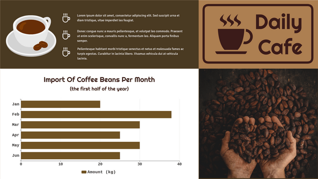
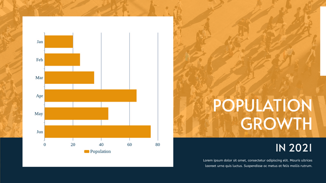
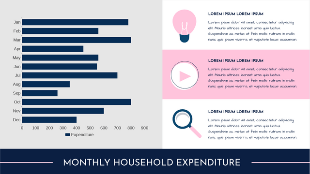
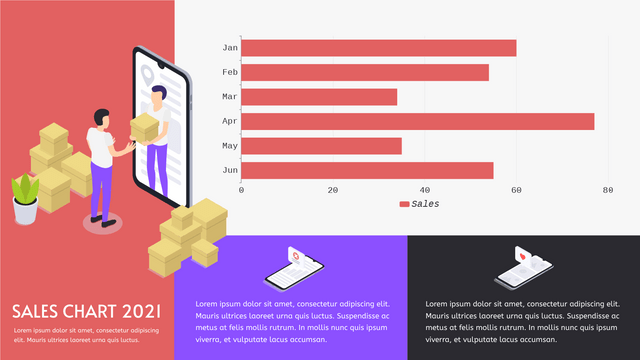
- Horizontal Bar Chart: Bars are displayed horizontally. Useful for long category names.
- Stacked Bar Chart: Each bar is divided into segments representing sub-categories.
- Grouped Bar Chart: Groups of bars represent multiple categories side by side for comparison.
When to Use Bar Charts
- When comparing discrete categories.
- When the data is categorical or ordinal.
- When you want to show changes over time with distinct time periods (though line charts are often preferred).
Case Study – Sales of Handmade Cake Last Year
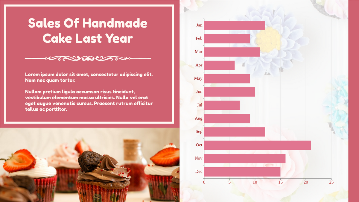
The bar chart appears to be a infographic presenting the “Sales of Handmade Cake Last Year” data. The key components of this bar chart example are:
- Categories: The categories shown on the x-axis represent the months of the year (Jan, Feb, Mar, etc.).
- Values: The values displayed on the y-axis represent the sales figures for the handmade cakes. The height of each bar corresponds to the sales volume for that particular month.
- Data Presentation: The bar chart provides a clear visual comparison of the sales performance across the different months. This allows the viewer to quickly identify the months with the highest and lowest sales.
The purpose of this bar chart is to summarize and communicate the sales trends for the handmade cakes over the course of the previous year. By displaying the data in this format, the business can easily identify patterns, peak seasons, and areas for potential improvement in their sales strategy.
The example serves as a good illustration of how bar charts can be effectively used to present categorical data, in this case, the monthly sales figures for the handmade cakes. The clear labeling of the axes and the intuitive visualization make it easy for the viewer to understand and interpret the information at a glance.
Interpretation of The Bar Char
Based on the information provided in the image, we can interpret the data and the bar chart as follows:
- Sales Trend: The bar chart shows the sales of handmade cakes over the course of the year. We can see that the sales fluctuate throughout the months, with some months having higher sales than others.
- Peak Months: The months with the highest sales appear to be October, November, and December. This suggests that there is a seasonal spike in demand for handmade cakes, likely around the holiday season.
- Slower Months: The months with the lowest sales are April, May, and June. This could indicate a slower period for the bakery, where they may need to focus on marketing or product diversification to boost sales during these months.
- Comparison and Insights: The bar chart allows for easy comparison of sales performance across the different months. This information can be valuable for the bakery to understand their sales patterns, plan production and inventory, and make informed business decisions.
- Potential Opportunities: By analyzing the data, the bakery may identify opportunities to optimize their marketing, product offerings, or production schedules to capitalize on the high-demand periods and mitigate the slower months.
Here is a summary of the key findings from the interpretation of the bar chart in a table format:
| Insight | Observation |
|---|---|
| Sales Trend | The sales of handmade cakes fluctuate throughout the year, with some months having higher sales than others. |
| Peak Months | October, November, and December have the highest sales, indicating a seasonal spike in demand around the holiday season. |
| Slower Months | April, May, and June have the lowest sales, suggesting a slower period for the bakery. |
| Comparison and Insights | The bar chart allows for easy comparison of sales performance across different months, providing valuable insights for business planning and decision-making. |
| Potential Opportunities | Analyzing the data can help the bakery identify opportunities to optimize marketing, product offerings, and production schedules to capitalize on high-demand periods and mitigate slower months. |
This table summarizes the key takeaways from the interpretation of the bar chart, including the sales trend, identification of peak and slower months, the benefits of comparison and insight generation, and potential opportunities for the bakery to explore based on the data.
Overall, the bar chart provides a clear and concise visual representation of the sales data, which can help the bakery better understand their business performance and make data-driven decisions to improve their sales and profitability.
Best Practices for Bar Charts
- Keep It Simple: Avoid clutter. Only include necessary elements.
- Use Clear Labels: Ensure that axes and categories are clearly labeled.
- Choose Colors Wisely: Use contrasting colors for clarity, but avoid overly bright colors.
- Maintain Consistent Scale: Ensure the scale on the axes is consistent to avoid misleading interpretations.
- Provide Context: Include titles and legends if necessary to explain what the data represents.
Conclusion
The bar chart provided in the image offers a clear and insightful visualization of the sales of handmade cakes over the past year. This data visualization tool allows the bakery to effectively analyze and understand their sales performance across the different months.
Key insights gleaned from the bar chart include:
- Identification of peak sales periods around the holiday season (October-December)
- Recognition of slower months (April-June) where the bakery may need to focus on marketing and product diversification
- Ability to easily compare sales figures across the year, providing valuable data to inform business decisions
By leveraging the information presented in this bar chart, the bakery can make informed strategies to optimize production, inventory management, and marketing efforts. This can help them capitalize on the high-demand periods, mitigate the slower months, and ultimately drive greater profitability and growth for their handmade cake business.
The effective use of this bar chart demonstrates the power of data visualization in providing clear, actionable insights that can fuel informed decision-making. As the bakery continues to track and analyze their sales data, they can refine their strategies and adapt to changing market conditions, ultimately positioning themselves for long-term success.
